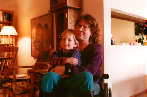
“Frequently, when I work on my web pages, I have some of my favorite – well, pretty much my only – alcoholic drink, which is cranberry juice mixed with white wine. I usually drink it out of my son’s Tweetie-bird cup, but a friend suggested recently that maybe the Sylvester cup would be more sophisticated. Now I can’t decide. (This text’s font color is cranberry-juice-referential.)”
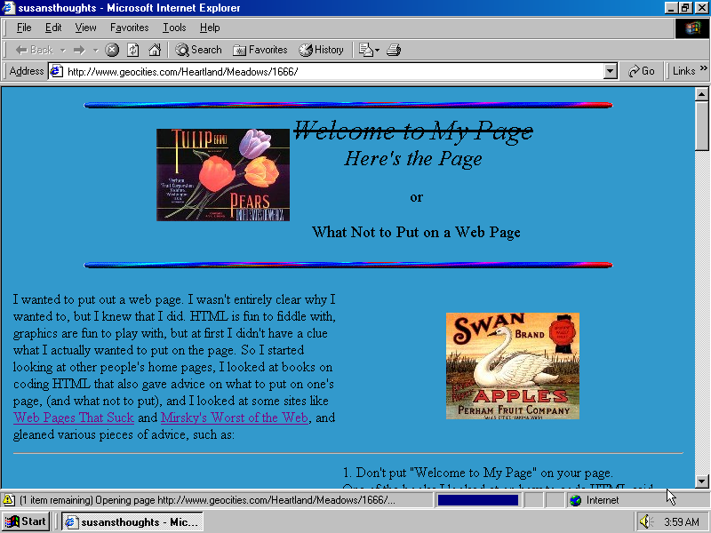
Susansthoughts moved into Heartland/Meadows/1666 in mid-1997 and was last updated in July 1998. It didn’t have a long life and it also didn’t become a comprehensive collection of thoughts or items. It is neither a portal nor a family archive. If it is not the first ever 90’s page you saw it will not blast your mind by its appearance or structure. Still, it is very special website.
“This site is self-referential. So is this sentence.” wrote Susan Schapiro about her own creation. This sentence is in the middle of the home page, so when I arrived to it I already knew that “self-referential” is an understatement. susanthoughts was not only a web page about web page or web pages, it asked existential questions: welcome or not to welcome?! Nudes or not? Anonymous or “Don’t not put your name anywhere on your page “. and 10 9 8 7 reasons to create a web page.
Imagine how lucky I felt when it appeared that Susan still uses the same email address she put on her website in 1997, and when she agreed to talk to me! Our conversation took place on the 14th of October 2018 in appear.in
Olia Lialina: Susan, can you remember why did you choose to be on GeoCities?
Susan Schapiro: I had a friend at work who had like a humor site at GeoCities… It actually didn’t even occur to me that you could do it any other way. It wasn’t even like I thought about it. It’s just if you’re gonna do a page at that point GeoCities is where you put it, unless you are somehow really knowledgeable about the web and I wasn’t.
And I had no idea of making a web page at all, it was quite alien to me initially. GeoCities was a place where you could do it without having to know anything about the mechanics of creating and updating a stand-alone site on a separate domain. (I did learn how to manage a separate domain pretty quickly, but when I was first working on the GeoCities site I did not know how to do that).
OL: Why and why in Heartland neighborhoods?
SS: Well, when I was thinking about putting a page on GeoCities there were various neighborhoods that were about specific things, and I didn’t really see it as being about anything, And Heartland seemed like sort of a friendly catch-all one, they called it the family neighborhood I think. So that seemed the best place for me.
OL: Maybe you also can remember a bit about the next thing in the url, why the Meadows suburb?
SS: I think that was just where I could find a place, I can’t remember. Were there Heartland other things?
OL: Yeah, there were a lot, but indeed, as this great article on neighborhoods explains, you could not choose.
OL: Were you an “angry” or a “grateful” GeoCities user? I put these definitions in quotation marks, because these are the tags I give respectively to the users who complained about the services or were happy and expressed their gratitude on their pages.
SS: I thought it was great. You know if somebody’s giving you a free service, it’s kind of rude to complain about it. Also at the time I would not have had a way to put something out without them and you know it was really fun to be a part of that little world. I don’t remember having negative feelings towards them. I also wasn’t using it after Yahoo bought it and you know took it over – maybe at that point I would have been annoyed also, but at the time I was using it I just thought this is great.
OL: What did you feel when you got to know that the GeoCities would be closed? And did you think about deleting your page?
SS: I had stopped looking at any of it, I stopped updating any of it long time ago. By the time I heard it was going to be closed. I wouldn’t have even known how to get into my page to delete it. I think I still could have figured out the URL, but no, it didn’t occur to me to delete it, and it also never occurred to me that anybody would ever see it again. I was very surprised when you wrote to me!
OL: On my side I was very surprised that you’ve answered! Usually my emails to GeoCities web masters bounce back immediately or I don’t get anything back. A related question: how did you feel when you got to know that I’m actually looking at your old site? Did you regret maybe at the moment that you didn’t delete it?
SS: I thought that was so much fun, that someone had happened to be on it again! I’m not embarrassed by it. It’s very much of its time, and I wouldn’t put that out today, but it was just right for the time.
SS: It wasn’t really a career, I was working full-time as a computer programmer at a bank, a mainframe programmer, that didn’t stop.
But I had learned HTML. I bought books. I just taught myself, it’s not really that hard, and by this point my son was going to a private school that my husband was also teaching at, and I did a website for them because, I knew how… and then we had a friend that we had met through the school who owned a little chain of hotels and they asked if I could do a website for them. And that I got paid for because that was a business and there were 18 hotels at one point and each hotel had seven or eight pages.
OL: What were these years when you were making websites for their hotels.
SS: It was the late 1990s.
OL: An important age question. What I could calculate from captions under the photographs, you were around 44 when you made susanthoughts?
SS: Right.
OL: There is a cliché that GeoCities were made by teenagers, by very young boys on girls …
SS: Um no, that maybe so but there was a whole community that was my age at that time. The people that I was aware of that I was that were contacting me and I was making contact to, they were all within my age range maybe thirties, forties. They were not twenty year olds or teenagers. A lot of us you know jumped on this and despite that stereotype that we were already too old to learn how to use the internet. Of course we weren’t..
OL: Let’s go though your home page. When I saw it for the first time it immediately attracted my attention, because you stroked through the Welcome to My Home Page
Welcome to My Page
Here’s the Page
In the next sentence you explained that you strike it through because
“One of the books I looked at on how to code HTML said “Don’t put ‘Welcome to my page’ on your page”, because people already know they’re welcome, so I tried to think how to start this without putting that on first, and really, it seems sort of stark without some kind of greeting. So my second idea was just to say “Here’s the page”, as an homage to my seven-year-old son, who has started saying “Bon appetit” at mealtimes, and I discovered that he thought it meant “Here’s the food.”
Tell me, were you making fun about the book? About people who wrote big and animated Welcome To My Home Page on their pages. Or was it a reflection on yourself dealing with the existential question: to welcome or not to welcome?
SS: I wasn’t really making fun of the books, per se, and it wasn’t an existential question for me (like “To be or not to be”). Like a lot of other things on the page, I was mainly trying to be a little bit funny and also discuss my thought processes about the page on the page. I do remember that I really did grapple a little with what kind of heading to use on the page, and I did see that advice (or rule) about not putting Welcome to My Page on the page, and really did think – but if I don’t put that, I thought, what would I put, since really, you need some kind of heading. I guess I was making fun of the books a little bit or else it was just that some of the “rules” didn’t make a lot of sense for something that was just a personal fun page (as opposed to some kind of business site).
OL: Do you remember what book was it?
SS: I don’t even remember what books I was using. The only names of places I can remember are the ones that I listed on my page. (Mirsky’s Worst of the Web, Web Pages That Suck) I did find them very entertaining to read, and I’m sure I actually did follow a lot of their advice. I also formed my own opinions after seeing things I didn’t like or that just weren’t my taste on other people’s pages.
OL: Do you have an example of something you didn’t like? I remember my personal absolute no go at that time were images or buttons that went through plastic wrap filter. Another thing I couldn’t stand were the borders around linked images.
SS: One major thing I remember hating was garish patterned backgrounds in bright colors. Typos and misspelling also really bothered me. They don’t bother me in e-mails, but I always felt a web page should at least be edited enough to prevent that.
OL: You’re also mentioning in the first paragraph “so I started looking at other people’s home pages” Were you looking only at the home pages or were you opening the source code of those pages?
SS: I never looked at the source code, I just looked at the pages.
OL: You think it’s the right thing to write your own code and not copy and paste and modify?
SS: I don’t think it’s particularly right or wrong. It never even occurred to me to copy other people’s code so I had no opinion about whether other people should or shouldn’t do that.
Because I do remember formatting is the hardest part of the coding, you know getting things positioned how you want them, and it wouldn’t even help to steal someone’s code even if I wanted to but I did feel that I was kind of too good for that.
OL: I’ve seen in the source code of your website that you used HomeSite 2.5, so you coded by hand.
SS: Yeah sometimes it helped by filling in a tag automatically but it is not one of those WYSIWYG softwares. You had to code in HTML. When I was first working on my GeoCities site, I don’t think I was even aware yet that WYSIWYG software existed. But I definitely would not have been using it even if I knew about it.
OL: I think I see the logic behind all of your design choices, but the little images on the top look like completely random. Can’t relate to anything you say.



SS: They are random. I was just looking for some kind of graphic that resonated to me in some way in its appearance and these are all fruit crate labels and I just liked them and I thought they were kind of subdued and low-key in a way that a lot of other pages weren’t.
They don’t have any – they’re not a reference to anything that’s on the page.
OL: Did you find them or did you scan them?
SS: I found them, I don’t remember where … I had bought some software that has some 10,000 images on it that you know are all available to you to use … but I actually don’t remember where I got them.
OL: Let’s move to the central part (for me) of you site where you count reasons to make a web page.
10 98 reasons to create a web page1. I need a URL of my own, so when I sign other people’s guest books with “Cool site! Come visit mine!!” – I actually have a site to direct them to. “Cool site! E-mail me!!” just doesn’t have the same ring.
2. If I buy up a lot of domain names like www.reallykillersite.com or www.reallyreallycoolsite.com, I’ll have something I can do with them when I discover nobody wants to buy them.
3. I need someplace to put all those cute gifs I’ve stolen from other people’s pages.
4. I need a place to display my son’s art work now that I’ve run out of wall and refrigerator space in my house.
5. I need a reason to use the scanner we bought because it was such a fun toy, but then had nothing to use it for. (see 4. above).
6. I need a reason to use the digital camera we bought because it was such a fun toy (and then had nothing to use it for (see above).
7. Because I can.(All right, 7 reasons.)
My first question. Why did you feel you had to put them on? Was anybody making fun of your decision to make a web page and you had to defend it?
SS: No! Not at all. I just thought it was funny!.. It was also a reference to, you know, the whole phenomenon of us creating these web pages at that time. I wouldn’t put any of these up now because everything is just different now, but at that time…
OL: What reasons to create a web page would you give today if at all?
SS: In the Geocities era, you really didn’t need any reason to have a page. A lot of having a page back then was just the fun of participating in this new Web world. It’s almost like a lot of us were just saying ‘Hi World!’. But by now our relationships with the Web have changed. The reasons for an individual having a site nowadays would be for either providing information about a specific topic that wasn’t personal (like a period in history, or something in science), or having some kind of fan page, or if the page was about yourself, it would be because you were an author or at least had some kind of prominence in your field of expertise. For the kinds of things a lot of us were putting out back in the 90’s the equivalent today would be a blog site, I think.
.A few months ago I noticed that my tampax has a URL. I like my brand of tampax, and I’m happy they exist, but I can’t imagine why I would ever want to go to their web site. I already know how to use them, and I just don’t feel a need to read more about them, or visit a Tampax Chat Room.
OL: Where are you present online today?
SS: Barely, I’m on Facebook only and I only got on Facebook actually so I could look for other people that I wanted to look up that were on Facebook. I think you had to be on Facebook to do that and a whole lot of people I knew were on Facebook and they immediately started friending me, but I never post anything.

OL: I scroll down your page now and come to “Spinal Cord Injury”. It is the first button in your menu and the most elaborated section in my opinion…
SS: right
OL: …. but it was not the main reason to start the website?
SS: I wasn’t thinking about that at all when I was first creating the site. It was only after I started working on the site that it occurred to me – Hey, I really do have something “real” I could include here.
OL: What surprised me was that I didn’t find links to other pages on the topic on your site.
SS: I wasn’t trying to do a general thing about that topic, it was about that topic and how it affected me.
OL: Was it also the topic that you were looking for on the pages of other people?
SS: No actually. I wasn’t on the web looking up other people with spinal cord injuries. I wasn’t in chat rooms. I wasn’t doing anything like that.
OL: There are not many external links on your website at all btw, which is quite unusual for 1997.
SS: Right
OL: “My Links” button is missing :)
SS: It wasn’t something that I felt like doing. That wasn’t what the point of the page was.
OL: Let’s talk about awards. Was it a nice feeling to get awards?
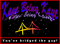




SS: Oh very nice yes, especially since I never asked for them. I was surprised that anybody had seen my site and liked it.
OL: Everybody tried to make something special out of their award.
SS: Right, and made one that showed something about yourself too.
OL: What happened with your own award “this site does not make me cringe”. Did people put it on their sites?
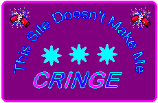
SS: I did award it to some people, pretty sure I did, but at this point I don’t remember who and I don’t know it if they did a link back to me. I don’t think I ever was paying attention to that.
At that period I wasn’t spending all that much time browsing a lot of other pages, it wasn’t how I wanted to spend my time.
OL: I see, I have a feeling that you lost the interest in your page shortly after you made it. You uploaded some of your son’s drawings on Gabriel’s page. And that’s it.

SS: I never got around to doing more.
OL: Do you remember if you had greater plans for this?
SS: I did have plans to put more out and I think I was reaching a point where I was just losing interest or you know just not getting around to doing it anymore. It wasn’t anything – there wasn’t a specific reason where I decided specifically I’m not going to. I think it was just very time consuming and eventually I just, I think I just didn’t want to spend all that much time. I didn’t have a lot of inclination to keep going back and the energy, to keep updating it all the time.
OL: Yeah, this is what happened to many web masters and web pages… and scanners. You reason number 5 suggests that web was the real opportunity for scanner owners. And you also left a note on in the bottom of What We Look Like page “our scanner was amused during the creation of this page”. But still you’ve stopped. You haven’t scanned and put online all your family album…
SS: No.
OL: Does your son know that you made this page for him?
SS: I don’t think he was aware of it. I don’t remember. It’s possible I showed him that I had put those out there but I don’t remember that I did.
OL: Did he later make a home page for himself?
SS: No, he never made a page. He is on Facebook, though, but he never did much with that. He is also on Twitter, but he only tweets about Sports.
OL: Now let’s talk as web master to web master. Why did you put a piano keys GIF on your page if there is no background sound? I was confused! I thought that maybe something is wrong with my sound. A page with a piano, but no midi on it! I looked in the source code but there was nothing!
![]()
SS: I think I just liked the GIF, I did play the piano. One thing I wanted to avoid was putting a lot of animated GIFs out there. But this one I liked.
OL: Okay, I see, so it is more about you than about the structure of the web page!
SS: The only page that has sound on it is Gabriel’s page. the music from the Disneyland Parade. It’s not like Disneyland was a huge thing for me but that music is very catchy.
OL: A lot of graphics I see on your pages are known to me, they are from free collections. But not the buttons in navigation. Obviously you made them yourself. Do you remember how?


SS: It was pretty thrilling that there was software out there that allowed you to make all kinds of fancy artistic effects. I particularly thought the effect where you could make a link look like a three-dimensional button was great. I was using Paint Shop Pro at the time to do that.
OL: Was your admiration of the buttons you created a reason to double the navigation on the page? ;) You see it on the left as usual, and then the same buttons, but scaled down in the very bottom of the home page page.
SS: Yeah :)) … I think this was common to have the navigation at the bottom of the page as well as you know in the body of the page. And I thought it was kind of classy to have all the navigation buttons exactly match their larger button. You know I have no idea how I would do it if I was doing it now. I wouldn’t have those buttons in the first place! :)) But at the time they were kind of cutting edge… now they look very obsolete.
OL: Can you say more about your other design decisions? Your every page has its own background its own style own bullets and buttons.
SS: I had different colors in the background of each page. I have a design that seemed to work for that page. I did work very hard on the design because it really mattered to me what things look like. I did not want to have what I perceived as design flaws on other pages that were very common at the time like very, very busy backgrounds. And when it’s hard to read the text because it’s too close to the background or it’s hard to read the text because the background is so busy. I was very conscious of that. Other than that it just was kind of fun to make everything slightly different. On the FAQ page you can see little graphics next to every question, they all are different to fit the topic.


OL: I assume they are all found footage.
SS: Yeah. I didn’t make any of those myself. I used the software you could buy that had numerous discs with thousands of images on them.
OL: And the most important question!You left a note on the first page:
Frequently, when I work on my web pages, I have some of my favorite – well, pretty much my only – alcoholic drink, which is cranberry juice mixed with white wine.[…] (This text’s font color is cranberry-juice-referential.)
What are the proportions?!!!
SS: The proportions are enough cranberry juice so that I can’t taste the wine! More like 3/4 to 1/4. If you like the taste of the wine then increase the proportions.
OL: Do you remember what is “cranberry” in HEX?
SS: Yes! #CC3366. And I’m still pretty sure that color is web safe and that was something that I was aware of and trying to stick to when working on my web pages!
OL: Thank you Susan, For your time and your thoughts!
And to all the readers out there, if you would like to talk about your home page, contact me at olia@profolia.org!
__
Other interviews in the series –> https://blog.geocities.institute/archives/tag/interview