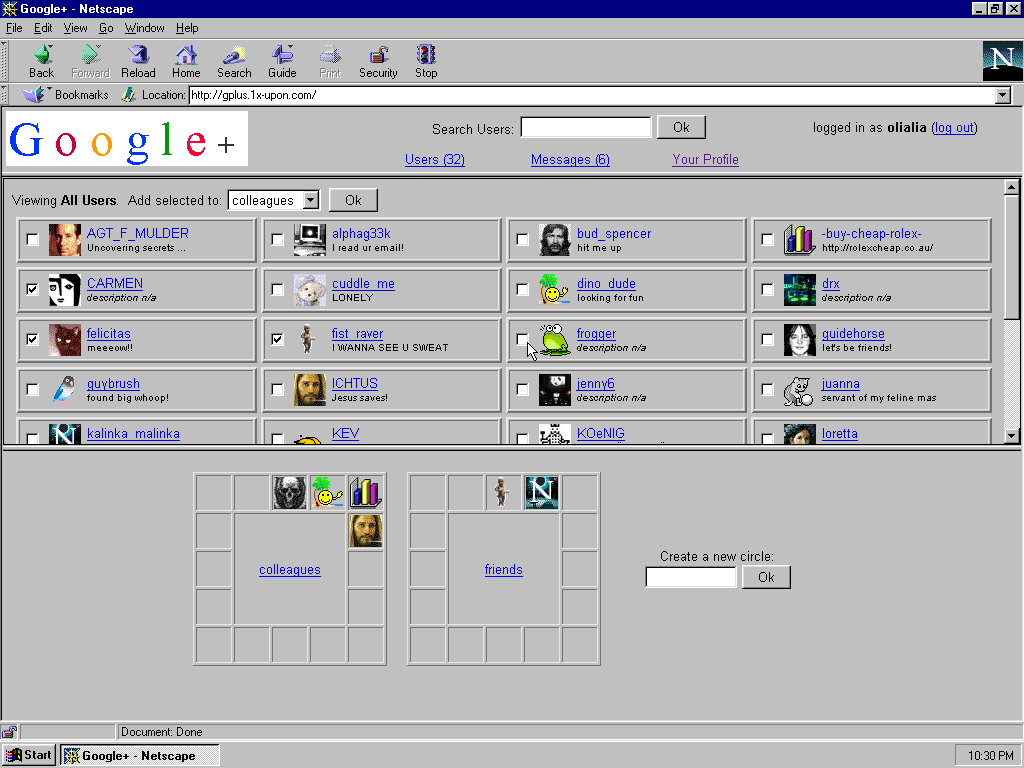
We made a new work about the web of the 90s — Once Upon. Thanks to top bloggers and twitterers it was reblogged, retweeted and got quite some attention and positive response.
But we can’t ignore that links to “Once Upon” mostly were tagged with humor, web humor, geek humor and the like. Which by itself is ok. After all we are not deadly serious and laugh about architecture and appearance of today’s social networks and smile at our own obsession to design with framesets and tables.
What really troubles us is the idea that we wanted to make fun about WWW of the last century, and that we wanted to show how ugly Facebook etc could look, or how ugly the web looked then. Even the most loyal commentors, even the most nostalgic ones, notice that we make the services “look ugly”1. Though we didn’t. Neither intentionally nor of ignorance.
We actually find our designs beautiful (as well as design of many Geocities pages we analyze in the blog) but here everybody is free to disagree. We really insist that our Once Upon designs are browser specific: They are modular — you see the borders in between data of different formats like pictures, text, and markup itself; and they don’t hide markup — you see borders of tables, borders of frames, scrollbars, default colors of links and background. In a slightly exaggerated manner they show the web’s native aesthetics.
And, sadly, this browser specificity is exactly what is considered to be “ugly”.
Remember the famous text by Dutch typo gurus, founders of Emigre magazine Zuzana Licko and Rudy VanderLans Ambition/Fear? In 1989 they reassured fellow designers:
There is nothing intrinsically “computer-like” about digitally generated images. Low-end devices such as the Macintosh do not yield a stronger inherent style than do the high-end Scitex systems, which are often perceived as functioning invisibly and seamlessly. This merely shows what computer virgins we are. High-end computers have been painstakingly programmed to mimic traditional techniques such as airbrushing or calligraphy, whereas the low-end machines force us to deal with more original, sometimes alien, manifestations. Coarse bitmaps are no more visibly obtrusive than the texture of oil paint on a canvas, but our unfamiliarity with bitmaps causes us to confuse the medium with the message. Creating a graphic language with today’s tools will mean forgetting the styles of archaic technologies and remembering the very basic of design principles.
Believe in “the basic design principles” and desire to overcome limitations of young technologies are mainstream. Professional screen design is all about forgetting. Forgetting and ignoring the browser, the interface, pixels, …
We should do something about it in 2012.
Happy New Year
olia
- See for example ubergizmo’s blog post. [↩]
One Response to Still “forgetting the styles of archaic technologies”