We live in a world where people say “GIF”, but mean “Animated GIF”. In the 1990’s, and during the first years of the new century — or lets say before this format’s glorious comeback — there were two genres: GIFs and Animated GIFs. There were collections of GIFs and Animated GIFs, there were famous GIFs and famous Animated GIFs. I was reminded about it by the welcome message on the Sailormars Transparent GIF page.
Here are transparent GIFs of my favorite sailor senshi, Hino Rei. I have collected some over the web and made some of my own.
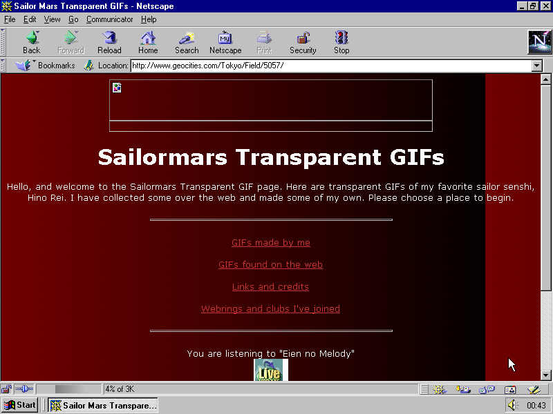
In January 1999, when the page was last updated, it was clear that the GIFs behind the link would be static. Here are some of them.



But why then GIFs and not JPEGs, especially knowing that images are technically scans of magazine pages? It is because of transparency. And the author of the collection manifests it clearly in the title of the site: Transparent GIFs! The ones that will work great on your own Sailor Mars page, regardless the color or texture of your background.
I think that today when we start to acknowledge another retro hero — the clear one pixel or invisible GIF — it is the right moment to remind that in the 90’s, the term Transparent GIF meant not an invisible pixel, but a GIF that is “cutted out”, that uses a principal feature of GIF89a format: transparent color. And their role in web site design can hardly be overestimated.
When a browser encounters the transparent color, the browser doesn’t show any graphic information, which enables the web page background to show through. That’s how Web pages create the illusion of non-rectangular figures.”
Creating Geocities Websites, p.169Properly anti-aliased images with transparency are the basic building blocks of a third-generation site
Creating Killer Web Sites, p.52
So, GIFs could be rectangular and transparent, static and animated. And there was another subcategory which I would call “GIFs formerly known as animated”. These are graphics that were originally animated, got famous as animated, but can be found as still elements on quite some pages.
The web got static explosion …


… static fire …


… and a cat that is just there.



Why would users stop the animation? I see three reasons:
- The animation was stopped to be used in the background in times before animated backgrounds became supported with Netscape 4 or Internet Explorer 4. Alternatively, the site’s author used a browser that didn’t support GIF animation at all and got only the first frame. This is BTW what Twitter made earlier this year with all the animated backgrounds of user profiles: it converted Animated GIFs to one frame PNGs. Mine looks like this now. And everytime I open my twitter timeline now I think I’m on Netscape 3 again.
- The user screwed up during uploading or downloading the animation or a technical error damaged the file.
- The author of the page read web design manuals before designing the page and got convinced that animated GIFs should be used with the greatest caution and be avoided completely if possible.
I know only one design manual from the second part of the 90’s that didn’t object animated GIFs, Creating Geocities Websites, published 1996. Other authors were quite straight about it.
David Siegel in Creating Killer Websites, 1996, mentions:
If you want your visitors to go out to lunch while your page loads, fill it full of 8-bit dithered GIFs …
p.137
Jakob Nielsen in Designing Web Usability, 1999, strongly suggests:
Ask yourself whether your point would be communicated as well by a non-animated graphic
p.143
Paul E. Robichaux in Jazz Up Your Website in a Weekend, 1997, reminds that animation is distracting and prolongs downloading time. He warns:
[…] don’t overdo it. Enough people have expressed annoyance with overuse of animated GIFs that Internet Explorer 4.0 and Netscape Communicator 4.0 both include options to turn off GIF animation all together.
p.202
Curt Cloninger in Fresh Styles for Web Designers, 2001:
The only thing more eye-catching than a transparent gif on a textured background is a transparent animated gif on a textured background. But first, a word of caution: as with all web animation […], use gif animation wisely and sparingly
p.28
When I read such instructions, I think how great it is that you didn’t have to read any instruction to make a webpage.
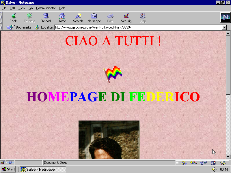
Some days ago my attention got attracted by this colorful screenshot:
I went to our archive to enjoy the rainbow flag and other elements animated. But it appeared that in reality, the web page of Italian architect Federico Cribbio looked the same as the screenshot. He used Formerly animated GIFs:
His Italian and European Union flags and even the gay pride flag didn’t flutter, the Welcome sign didn’t rotate, “Chiao a Tutti” was not blinking. He also paused the two hippos, who were born to tramp the backgrounds of early web pages.
 Federico Cribbio either got unlucky uploading his images or took design manuals a bit too seriously. On the other hand, maybe he knew that once his homepage will be just a screenshot posted on Tumblr.
P.S. You may also want to read some notes about previously static files becoming animated. And have a look at the comparative gallery of Animated GIFs and Glitter graphics, it features graphics from the beginning of the last decade, when GIFs got huge, blingy and static.
