tl;dr: 1TB of KB Age switched to Internet Explorer 6 and Windows XP, but we don’t go for 1024×768 … yet.
Our Tumblr blog One Terabyte of Kilobyte Age Photo Op started in February 2013. It became popular, people were exited about seeing a new snapshot of the past every 20 minutes. Web pages last updated before the advent of e-commerce and social networks, framed by the sweetest browsers with the cutest logos provoked nostalgia even among the followers who were born after these pages went live on the web.
Fifteen months later we made an unpopular but necessary change. Screenshots switched from being created with Netscape to Internet Explorer 5. To say the truth we were really postponing that decision as long as possible, but the 19 March 1999 release of IE5 was the border after which we couldn’t represent the web inside of a browser that no one used any more.
It is almost 2018, almost 5 years from the launch, and we are on the eve of the next big sad change. This time it is not connected to any particular moment in the history. It just happened that some weeks ago the repository of snapped sites got empty, and it was time to restart Dragan’s screenshot factory and discuss the appearance of pages that were last updated in October 2001.
One thing was clear, time has come to change to Explorer 6 and stay with it till the last screenshot we have.
Another thing we seriously considered these last days was switching the screenshots’ resolution to 1024×768 (XGA).
I wanted to use this break in the Tumblr blog’s flow to address the issue, which was eating me from the inside for quite some time already: the eligibility of 800×600 (SVGA) to represent web pages of the 3rd Millennium.
There appeared more and more pages stating that they are best viewed in 1024×768; more and more often I stumble upon sites that are made for this resolution.
Add to it my personal memories about having 1024 monitor already in 1999. Plus the knowledge that Yahoo!’s Page Builder templates were designed for a 1024 pixels wide window, already 2 years prior to the time we are looking at now…
…and you know how I feel. Namely, I feel like I am a very mean researcher who makes old web pages look older than they are.
On the other hand, what I just described as “more and more” is only a perceived increase. Pages that are made for wider screens are still a minority among GeoCities pages last updated around the turn of the century: 3 of 100, as a quick test of 100 web pages last updated in July 2001 showed.
The vast majority still looks good or best with 800×600, and a lot are adjusted to look fine or ok even at 640×480. Either they were made for it, or their webmasters followed the rule that a web page should look proper first of all on the smallest of screens—an approach that we know today as “mobile first,” but before mobile.
Also, if it looks bad on 800×600, there is no guarantee it will look perfect in 1024×768.
Also, I noticed that many pages announced to be designed for or look best with XGA did away with flexible layouts, a web design paradigm that came back a decade later under the name Responsive Design): content arranged into HTML tables with dimensions defined in percent values and therefore adapting to the available screen space gave way to exact size exact definitions in pixels, or exact pixel coordinates on the page. This stagnation in web design, caused by an increased availability of graphical WYSIWYG page editor software and professional graphic designers creating pages in Photoshop, started already in 1997; it was then deepened by the burst of the dot.com bubble in 2001, and with XGA resolution and Internet Explorer dominating users’ desktops at least from 2004 through 2008, there was hardly a reason to keep web layouts adaptive.
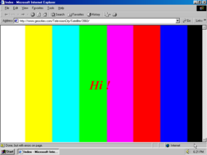
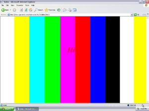
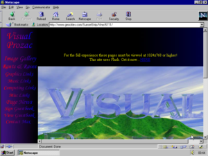
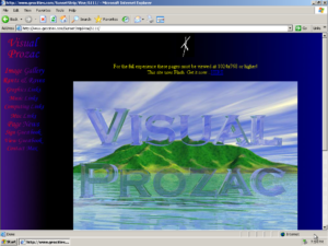
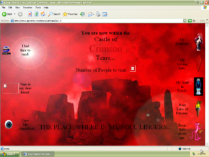
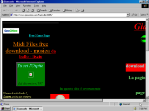
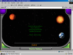
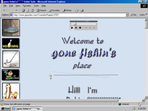
800×600 screenshots demonstrate this inflexibility very well. It would be a pity not to see it.
And finally, the claim that a page looks better in XGA doesn’t mean it looks worse in SVGA.
Quite often i see the pages that seem “incomplete” because the bottom part is not visible in a lower resolution. But, on second thought, isn’t it exactly the act, the necessity of scrolling, that provides a wow or comic effect?
Furthermore, statistics show that 2002 started with 60% of users accessing the web with a lower resolution than XGA.
So, ??
Based on these statistics and personal observations we can rightfully stay with SVGA up until 2004. And if we want we can find reasons to show GeoCities pages in this classic resolution, synonymous with the web’s golden days, till the last screenshot.
But is it what we want?
History and nostalgia are not the same. GeoCities was seen (and ridiculed) by people in front of 1024×768 monitors since 1997. Shouldn’t it be part of history? XGA was there when GeoCities was aging, and when it was killed. Actually (looking at statistic again) they both died the same year.
Our Tumblr blog’s role is to feed the web with its past. It is tempting to conserve and show amateur web productions in smaller form, because it makes them look better, younger. 800×600 is like a beauty filter for web pages of all ages. Looking at the web through it you get sentimental.
If 800×600 is the web’s ceremonial portrait, 1024×768 is it’s hidden camera, it reveals what had to be hidden.
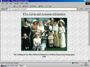
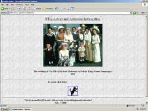
On a bigger screenshot you see how the amateur web was shrinking and shriveling, you can get sense of how it was becoming small and unimportant. Not only when something is obviously wrong as above, but maybe even more in the case below: where everything is still alright, but you get the feeling of the web page aging, of belonging to another epoch.












One Response to Is 1024×768 showing more or less than 800×600?