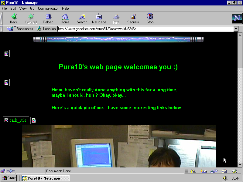
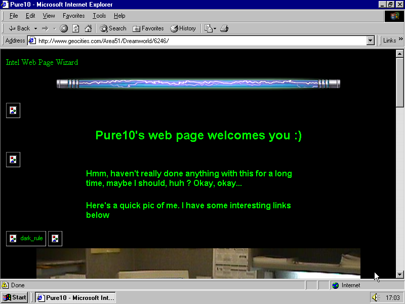
One day in 1998, Pure10 moved into the Dreamworld suburb of the Area51 neighborhood, house #6246. He build his home page using Intel’s Web Page Wizard. He made index2.html with more pictures, and index3.html which tells more about him, and Index.html with “Possibly more stuff to come”.
In an attempt to modify the template he made quite some copy-paste mistakes and messed up the HTML syntax. To the search engines of that time he wrote:
Matt, Pure10, pure10, PURE10, dudes, dudettes, corrado, Corrado, G60, Suzuki, Katana, waverunner, map, Mcmurray, McMurray, PA, rmc, RMC
Late in the evening on March 17th 1999 he revisited his Geocities home and noticed: “Hmm, haven’t really done anything with this for a long time, maybe I should, huh ? Okay, okay…” Pure10 uploaded a new pic.

He added links to the Corrado Club of America, weather forecast for Pittsburgh, USA airways and stock market charts, then sent his files to the server for the last time. He made it in the first minutes of a new day, at 00:24:42. This is how his homepage became the first one to be last updated o the 18th March 1999 — the day when Microsoft released Internet Explorer 5.
Pure10’s page becomes the first one rendered in Internet Explorer in our archive and to appear in this new frame on Tumblr. 15 years later it is the date when we at the Geocities Research Institute say good bye to Netscape and switch to Internet Explorer.
Dragan Espenschied justifies this move:
With the release of Internet Explorer 5 and it being shipped with Windows 98SE and Windows 2000, this browser can be considered to be the default window into the web for a long period of time.
We don’t do it with light heart. We know that our followers will be disappointed, we will miss it ourselves, but to continue with Netscape would mean to go nostalgic, to ignore history.
The framing of Netscape made every page look great, with Explorer it is different. To quote Dragan again:
While Netscape considered itself a product with a strong identity and therefore very recognizable visual design,1 Internet Explorer tried to look like an utility, the web becoming part of the operating system. So while Explorer copied the structure of Netscape’s user interface, its appearance is more modest and transparent. With its toolbar being smaller than Netscape’s, web users gained a few more pixels, the Microsoft-Windows-only ActiveX plugin interface, smooth Java integration and many proprietary tags like <marquee> opened up new forms of expression — yet in hindsight Explorer’s staggering dominance is regarded as a dark age of the web. For most users, an actual loss was experienced through the lack of Explorer’s support for the <blink> the tag — a widely used way of bringing animation to the web, introduced by Netscape in 1994.
One thing is for sure: you will see much fewer home pages with garbled text on them. While Netscape strictly adhered to the HTTP protocol and displayed non-latin alphabets only if the headers were set correctly — which many users did not know about –, Explorer tried to find out on its own what character encoding a page might be written in, and was guessing right more often than not.2
So, enjoy a glimpse into the web of 1999 written in Vietnamese, Russian, Korean and Chinese.
- See an overview of how Netscape looked on different platforms at Two Rovers Consulting, the designers in charge for it. [↩]
- We also have improved on the HTTP headers sent to Netscape in the meantime, some of the older home pages now would show up with the right character set if visited again. [↩]


 . The sign can compete in popularity only with the under construction ribbon. Steve is also the author of the restless counter
  . He made the warm welcome to the internet
  and left an important reminder
  . In 1995 he put these and other graphics (99 in total) together on the
  recalls:
 it is the one Steve Kangas used for his crying icon
  .
. , early web adopter and founder of the Italian W3C . He confirmed, that all the 7296 GIFs were collected by him, not created. He saw himself as a search engine, as an aggregator:
