HTML frames, introduced to web users in 1996 with version 2.0 of the then-dominant browser Netscape Navigator, offered a way to divide the browser window into rectangles, each showing a different HTML page. A lot has been written about this most controversial tag in the history of markup languages. Already in the year it was created, usability experts announced that it breaks fundamental rules of hypertext and navigation. Users, until this moment happily following all new technical enhancements given to them with each software update, developed strong opinions if frames should be used or not.1 Finally, in today’s web, frames are not used anymore – they even have been removed from the HTML5 standard.2
All this battle aside, fact is: Frames made possible new kinds of structures and graphical effects not possible before in the browser.3 And Geocities carries thousands of examples on how amateurs used them. Remarkably, the frames debate is very present in their pages’ designs, because visitors are in most cases given the choice: frames or no frames.

Original URL: http://www.geocities.com/SoHo/Gallery/2826/
Asking web site visitors such “technical” questions is professionally considered a capital usability offence. In some corners of today’s web you can still find the quite similar “Flash or HTML?” But frames or not wasn’t only a technical question, it was a new approach on how to deal with controversies online: just give people a choice and everybody will be happy.
So when visitors had to decide something anyway, many webmasters used the opportunity to create welcome pages describing what’s laying ahead.

Original URL: http://www.geocities.com/Tokyo/Towers/7492/
In many cases their appearance differed from the following actual web site, deliberately standing out in the navigation flow and creating dramaturgy. The MIDI Universe for example embeds the question whether to use frames in a space setting. Take a step back and consider the big picture! The following pages give the impression of having zoomed into the cloud or ocean surface of the planet. Dive in!

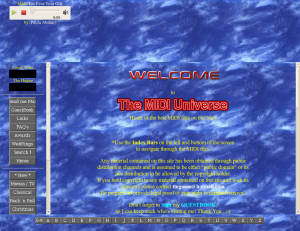
Original URL: http://www.geocities.com/SunsetStrip/Palms/7120/
Speaking of MIDI: Of course any serious web site with music playing in the background would use frames: one constantly holding the music player while others could be used to navigate around.
Typically, one of the frames was filled with links to all parts of the site, and the minimal setup consists of just two frames, navigation aid and content. This meant that webmasters had to provide two navigation systems, one for frames and one for no frames. The most efficient way was probably to include the no frames-navigation on the site’s first “content” page. The downside of this approach was that in frames mode, visitors would see the navigation two times, once in the navigation frame and once in the “content” frame.

Original URL: http://www.geocities.com/SiliconValley/Lab/5481/frames.html
Another very popular style was to create a different starting page with the navigation for no frames that would not show up in the frames context. Since webmasters offering frames usually also preferred the frames mode, the no frames version would in many cases fall out of their sight, soon be forgotten and missing updates.
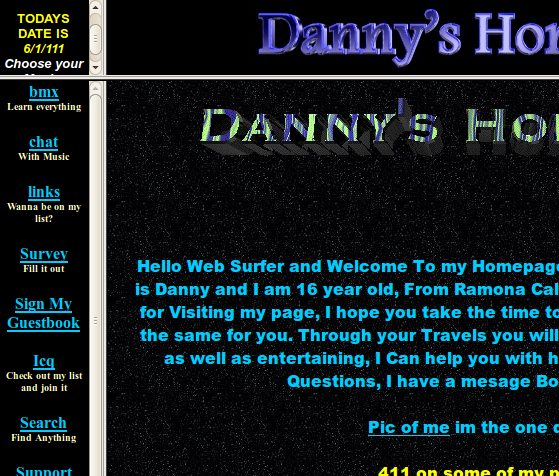

Original URL: http://www.geocities.com/SouthBeach/Boardwalk/2643/
Commercial web sites liked to use frames for branding. Splitting the browser window allowed to place a visually stable logo on screen that wasn’t affected by the visitor scrolling in another frame. Of course amateurs did the same with their sites and branded them with their names or their made up companies’ names.
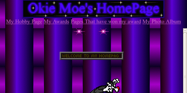
Original URL: http://www.geocities.com/SouthBeach/Sands/5486/
Some frame branded pages would display double branding, with two different logos. The reason is similar as with navigation frames: The frames version shows an additional logo, and no frames got its own logo. I suspect that many webmasters created two different logos on purpose, because it looks much less confusing than having the same logo twice.

Original URL: http://www.geocities.com/SouthBeach/Boardwalk/2643/frames.html
Finally, the choice of frames vs no frames reflected the joy of playing with new technology. Many sites were started before frames became available as a design tool. So when web masters added them later, they got filled with elements not necessarily related to the rest of the pages, very likely “multimedia” things. It is common that a frames site contains Java applets, MIDI music, javascripted scrolling and so on. No frames was there as a safe option, for people who had’t yet upgraded their browser or owned a weak computer that couldn’t handle displaying six HTML pages at once.
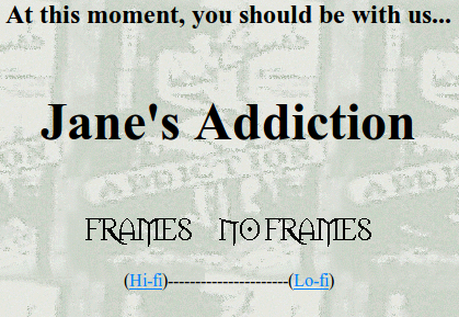
Original URL: http://www.geocities.com/TheTropics/Shores/9911/menu.html
Assorted examples

Original URL: http://www.geocities.com/RodeoDrive/1031/

Original URL: http://www.geocities.com/SouthBeach/9128/
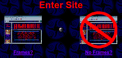
Original URL: http://www.geocities.com/Hollywood/Set/4440/
Original URL: http://www.geocities.com/SouthBeach/4413/
- See the part about frames in Olia’s “A Vernacular Web” for more details on the impact of this tag. [↩]
- Read some condolences by Tobias Leingruber. [↩]
- And the later established style of frame layouts would become a strong sign for “online” in print design as well. Advertising posters for online companies for example would show compositions reminding of framests. [↩]
Pingback: The RPS Advent Calendar 2019, Dec 10th | Rock Paper Shotgun
Pingback: The RPS Advent Calendar 2019, Dec 10th – Torrct