Monthly Archives: January 2011

On a page without a title, according to the meta tags created with “Internet Designer Pro 300”, I found this distorted GIF on a completely black page.

Usually I don’t like it that the current generation of Browsers treats everything like a photo and enlarges pixely GIF animations by blurring and mushing. This happens when for example an image is originally 32 pixels wide, but the browser is instructed via HTML to show it 128 pixels wide. Instead of exposing the pixels as they used to, today’s browsers use unpleasant interpolation, hiding their digital nature.

Artists working with enlarged pixel animations rightfully hated this change in GIF treatment, but after some time responded with image files that already contain the zoomed version, done with an algorithm of their choice.

I assume from the style of the source code that when the page was originally created, the image would be displayed like this:
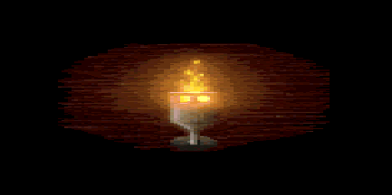
Strangely, in this case the blurred version is much more fascinating. Not only does the flame look like a candle on a grave, it is already so old that the method of displaying images itself has changed. I almost see the years passing by.

Original URL: http://de.geocities.com/feloxxl/

In 2004, British designer Bruce Lawson made a contribution to css zen garden (a collaborative effort to prove that CSS is a standart of web beauty). His theme was called GeoCities 1996.

In 2010 US designer Mike Lacher created a tool that would “make any webpage look like it was made by a 13 year-old in 1996!” and called it Geocities-izer.

Two wonderful, very skillful projects, dealing perfectly with web aesthetics of the mid 1990’s. Both include Geocities in their names, which makes a lot of sense, because Geocities was the place filled with web amateurs.

But aesthetically Geocities are not identical to the Amateur Web. Geocities sites were easy to distinguish from the rest of the web pages with animated GIFs and star backgrounds, because they included:

  • commercial banners,
  • the “g” logo following the scrollbar,
  • prefabricated HTML templates

At this moment it is not clear when these banners and branding elements vanished from Geocities, or if the bulk of tricky javascripts just wasn’t saved by the Archive Team.

The real Geocities style is less modular and more corporative than the fully independent Amateur Web. In the second part of the 1990’s it was obvious. 15 years later one has to make an effort to recall some details and to see differences.

Phenomenal Women Of The Web is a webring and portal where “Membership is open to all women who maintain a website and it is FREE!” Naturally, many Geocities pages created by women link to this site.

It features a phenomenal <table> logo that adapts to the width of the browser window:

The sub-project Phenomenal Diva follows the same design pattern.

Seemingly, a Microsoft Office clipart was modified with shiny gradients for Michelle’s Cyber Pet Adoptions page.

The layout is still made from a lot of <tables>s, but CSS dashed borders are used to decorate them with effects. Probably this was caused by a long standing page that was updated with late technologies as they became available, without doing a complete redesign.

Original URL: http://www.geocities.com/DiamondDoberman/index.html

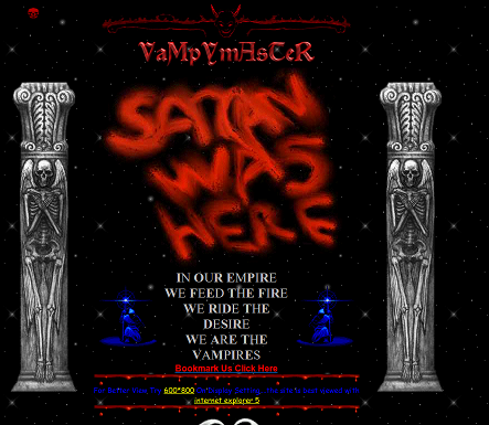
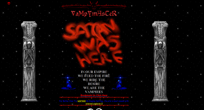
VaMpYmAsTeR’s beautiful page, although last updated in the year 2000 and designed for a screen resolution of 800×600 pixels, looks quite impressive on today’s high resolution monitors. As most amateur web pages of the 1990’s, it uses a table layout with variable width. An almost forgotten art.

Original URL: http://www.geocities.com/DevileSon/

Looking at the source code of the first domain in the CHOWDERDOMAINS directory —
http://3rdnjcavalry.com/, — I saw that it was full of references to ancient Geocities
Clipart.

I found it strange, because it should mean that the site would have to be full of missing images. But it is sort of OK. So I click
http://www.geocities.com/clipart/pbi/backgrounds/Template_Pages/SkyBlueImg2.gif
and see that this address is absolutely alive! http://www.geocities.com/clipart/pbi/backgrounds/ is still there!

http://www.geocities.com/Heartland/Woods/2425/
http://www.geocities.com/EnchantedForest/Glade/4559/
http://www.geocities.com/Athens/Acropolis/1465/

These are not the pages from the torrent, just some links found on gorgeous
http://abney-family.com/, a site last updated in 2001.

They have classic pre-1999, or pre-Yahoo Geocities URL structure: neighborhood/suburb/xxxx

Unfortunately, when Yahoo! took over GeoCities in July 1999, Yahoo decided to make the whole Neighborhoods and Homesteads theme defunct [ …] Yahoo decided instead to go with “vanity” URLs to tie in with users’ Yahoo IDs

recalls Blade, the author of a comprehensive list of all GeoCities Homestead Neighborhoods and Suburbs.

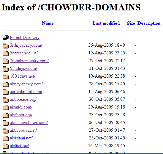
Surprisingly, the first directory in the Geocities Torrent — CHOWDER-DOMAINS — is a long list of almost empty folders with domain names, not Geocities subfolders. There is nothing about this directory in the README.TXT or IMPORTANT.TXT.

What all these domains have in common is the Yahoo counter, found at the very end of each site’s source code.