Original URL: http://www.geocities.com/Vienna/Strasse/2914/

Original URL: http://www.geocities.com/Vienna/Strasse/2914/
Original URL: http://www.geocities.com/SoHo/Lofts/4165/
Following links suggested by webmasters of SoHo and Heartland neighborhoods I came across TableMaker and FrameShop.
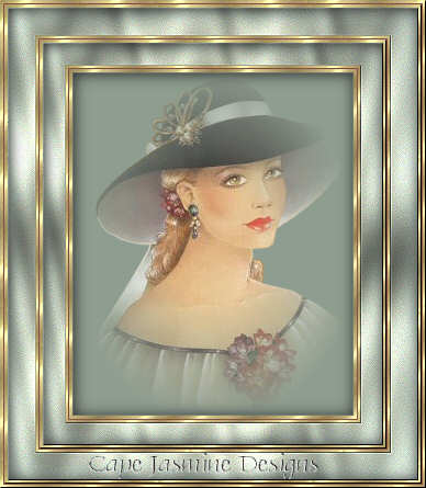
Barbara is a true table master. Her trick is to nest a table into the table into the table. It was not at a unique technique, but Barbara’s little trick was to fill every second table with the goldfill1.jpg background.

This made her layouts really shiny.
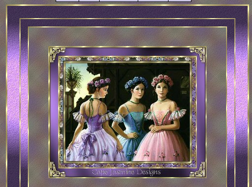
Barbara is also the author of many precious bordered backgrounds: flowers, angels, butterflies and gems on a black backdrop.
Her terms of use are:
“My backgrounds are linkware. That means if you use them, you provide a link on your page back to this web site and that you send an e-mail message to let me know so I can add you to this page. I don’t feel that this is too much to ask.”
Original URL: http://www.geocities.com/Heartland/Bluffs/1646/

In the web’s early days responsible webmasters were constantly excusing if they used many images on their home pages. It could take ages to download over dialup or even crash Netscape. The typical form was “heavy graphics coming up, click here to proceed”; the pictured JavaScript alert box would leave no choice though: users could (and still can) only click OK and hope for the best.
Original URL: http://www.geocities.com/Heartland/Park/1571/

This is an a award! Given by LadyMadona. Ladymadona.com is a parked domain now. And archive.org says: “We’re sorry, access has been blocked by the site owner via robots.txt.”
Original URL: http://www.geocities.com/Petsburgh/Farm/8331/
Homepage Sets are graphic collections of navigation buttons, backgrounds and dividers that somehow fit together. It would have been a stretch to call them templates because there was no pre-defined form for headlines, blurbs, photos or articles. For example this “executive set” contains most things one would need for a classic home page:
Backwards and Forward, Guestbook, Home Page, Links, Email, “own stuff” (e.g. writings), Help and Photos.
It was designed by “Shawna”, as well as dozens of other sets. Many Geocities users offered self-made sets like these, for anybody to copy and use. But Shawna was apparently able to sell some of her creations. She removed the data for sold sets, so it is not possible anymore to find out what made them commercially successful. Still this list can serve as a small market research on what topics could be interesting for today’s web designers, ordered by sales:
Animal sets:

Country sets:

Executive sets:

Fresh Flowers:

Flower sets:


Miscellaneous sets:


Victorian sets:


Genealogy sets:


Jeweled sets:


So, aspiring designers should put some work into their genealogy and jewel portfolios. What about creating WordPress and Gmail themes like these?
BTW, the categories Angels, Designer, Fantasy, Holiday, Kids and Masculine didn’t sell a single piece. This means something, Shawna has been in the biz since 1998.
Original URL: http://www.geocities.com/SoHo/coffeehouse/5922/