“Another passion (ok, obsession) of mine is computers. I bought my first 8 years ago for my son, but he had to fight with mom to get me off of it when he wanted to use it. I got my latest one last year and this one is MINE! Recently, I’ve been having a ball playing around with PaintShopPro and making graphics (ok, I’m obsessed with graphics, I made so many I now have a graphics site – Obsessive-Compulsive personality, maybe?)”
Shawna,
April 1999
I have been using your graphics and they have really helped my page look the way I want them to. Thank you so much for sharing your wonderful work. I have visited some other graphic sites and some of them were very good, but I haven’t found one as good s yours. Thanks again.
Vicki Jones,
August 2000
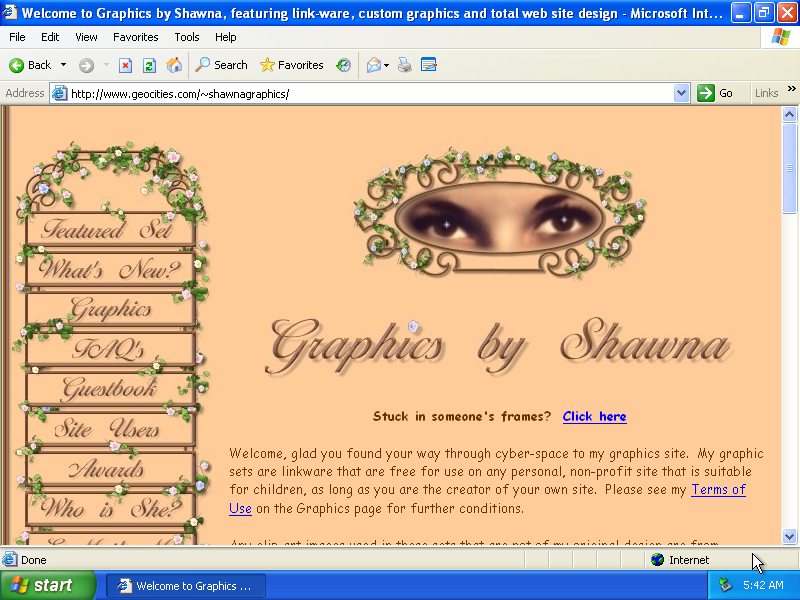
Earlier today a very significant screenshot appeared on One Terabyte of Kilobyte Age — the home page of Graphics by Shawna1. She moved into the SoHo neighborhood, Coffeehouse suburb, 5922 in September 1999 and last updated the home page on October 8, 2005.
I stumbled upon this site many times before I started to work with the GeoCities archive and maybe even before my Vernacular Web research took its shape. The reason is that Shawna’s designs, layouts, and graphics were very popular and since they were distributed as “linkware,” many people who used them put Shawna’s button in the bottom of their pages with a link back to her site.







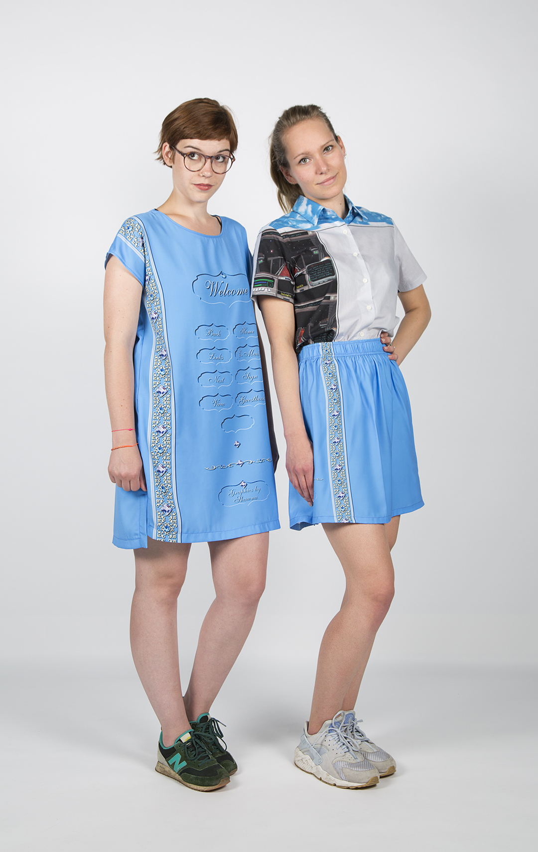
Since 2011 there is one  at the bottom of my own home page too. To express my respect and admiration to Shawna’s creations I used 3 of her sets at once. In 2017 her jeweled set “bluegem” became a motive for a Shawna dress and a Shawna skirt, garments of the Webmaster Summer collection.
A registered nurse, Shawna Kaye Green Hall (b.1951) belonged to the early webmasters who came to the web either shortly before or shortly after their retirement. In 1999 she mentions on her me.html that she will retire in 3 or 4 years. Contrary to the common belief that the amateur web was build by 13 year old boys, it were mostly much older people who took care about making, collecting, and organizing interface graphics, like back and home buttons, welcome signs, etc, as well as decorative elements, like bullets, rules, background images. Think of Lucy and Alan Richmond, who retired from NASA to start stars.com, where the first web developers could find tools and elements to make their pages; Royal Frazier, founder of the first GIF gallery; Randy D. Ralph who put together the Icon Bazar; not to mention Chuck Poynter; who we should thank for the Dancing girl and other early GIFs.
Shawna became active online in early 1998 when she started to make her genealogy page. A later version of it is still online and was last updated 2013. Making her own site made her realize that she can also provide elements for other people’s sites.
As she writes on the 1st version of Graphics by Shawna available on the Internet Archive on the 18th of February 1999:
My interest in graphics began when I was looking for a set for my genealogy page. I couldn’t find a set that I liked, so I decided to design my own. I bought Paint Shop Pro, followed some tutorials and went at it. Although I have no computer, art, or graphics training and these aren’t the best sets you’ll see on the web, I enjoy making them and hopefully you will enjoy them too.
So called “sets” that Shawna mention are a very interesting phenomena of the vernacular web and a facet of Digital Folklore. According to my excavation, in the beginning of 1998 — parallel to professionalization and photoshopization of web design — amateur web makers started to make steps away from eclectic page designs (i.e. combination of different elements found on different web pages) towards homogeneous, solid appearances and aesthetic integrity, as usability guidelines would refer to it around the same time. This basically meant that the background of the page would be consistent with title elements, buttons, and other elements; and they all would share the same color palette. Which also meant that elements were produced all together by one person and published as a package, a set. Some made sets for themselves. Others like Shawna didn’t stop and produced more different ones for others. And again it was mostly ladies in their 50’s and 60’s who became prominent in providing building blocks to those who were keen to make their web pages themselves, but lacked graphic design skills, necessary software, or didn’t trust their own taste.
Next to Shawna, I should mention here Beverly Zuerlein, the originator of MOON AND BACK GRAPHICS; the queen of christian table sets Marsha Durham of Marsha’s Graphics; and Sonya Marvel of Marvel Creations, her domain belongs to someone else now, but a big part of her sets is still available on https://sfmarvel.tripod.com/.
There were three types of page sets: plain, bordered, and table. Plain sets were based on a tiled background image and fitting navigation elements. The core element of a border set was a long and narrow background image with an ornament on the left. This ornament would then also appear on the other set elements. Table sets looked an functioned differently. It was a combination of different backgrounds and colors packed into nested HTML tables. Apart from being rich and magic in their appearance, they were also similar what we later started calling “responsive design.” Since tables dimensions were defined not in exact pixels but in relative percent values, they fit perfectly to nay size of the browser window. See some examples from my table sets collection: a, b, c)
There are several plain and table designs to find on Shawna Graphics, but the majority were bordered ones. The backgrounds themselves were in between 1600 and 2000 pixels wide. I assume that longer ones were made later to keep pace with increasing resolution of computer monitors. But even the longest ones do appear twice on my current 2K monitor. The last image in this row is 2365 px wide and comes from Shawna’s own site that was last updated 10 years ago. In 2001 the same image was 1000 px shorter, according to the Internet Archive’s memory of the site.


Every set included a welcome sign.






Except the sets that were made for special occasions.



The main sign was followed by a group of navigation buttons. They were not the same on all the sets. Often “guest book” or “about me” were missing.

![]()


![]()




Shawna always added an empty button, that users could customize with their own label. Information about the font to be used in the sets was provided as well.


Next came bullets
![]()
![]()

![]()
![]()
![]()
followed by proper dividers.
![]()
![]()
![]()
![]()
![]()
![]()
In the bottom of every set there was a copyright button, that, as mentioned above, grateful webmasters gladly put on their pages with a link back to Shawna Graphics. In the beginning Shawna in turn linked back to the pages that were built upon her sets from the ![]() section, but lost track in September 2001, when there were more than 400 sites in her collection.
section, but lost track in September 2001, when there were more than 400 sites in her collection.
- actually three screenshots in a row popped up in the timeline, because Graphics by Shawna existed under three addresses
http://www.geocities.com/SoHo/Coffeehouse/5922/
http://www.geocities.com/shawnagraphics/
http://www.geocities.com/~shawnagraphics/
[↩]