HTML frames, introduced to web users in 1996 with version 2.0 of the then-dominant browser Netscape Navigator, offered a way to divide the browser window into rectangles, each showing a different HTML page. A lot has been written about this most controversial tag in the history of markup languages. Already in the year it was created, usability experts announced that it breaks fundamental rules of hypertext and navigation. Users, until this moment happily following all new technical enhancements given to them with each software update, developed strong opinions if frames should be used or not.1 Finally, in today’s web, frames are not used anymore – they even have been removed from the HTML5 standard.2

All this battle aside, fact is: Frames made possible new kinds of structures and graphical effects not possible before in the browser.3 And Geocities carries thousands of examples on how amateurs used them. Remarkably, the frames debate is very present in their pages’ designs, because visitors are in most cases given the choice: frames or no frames.


Original URL: http://www.geocities.com/SoHo/Gallery/2826/

Asking web site visitors such “technical” questions is professionally considered a capital usability offence. In some corners of today’s web you can still find the quite similar “Flash or HTML?” But frames or not wasn’t only a technical question, it was a new approach on how to deal with controversies online: just give people a choice and everybody will be happy.

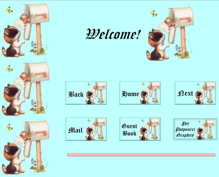
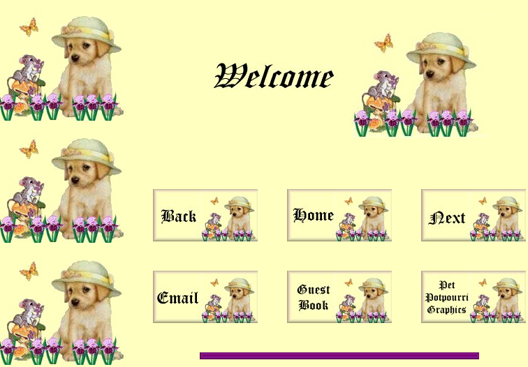
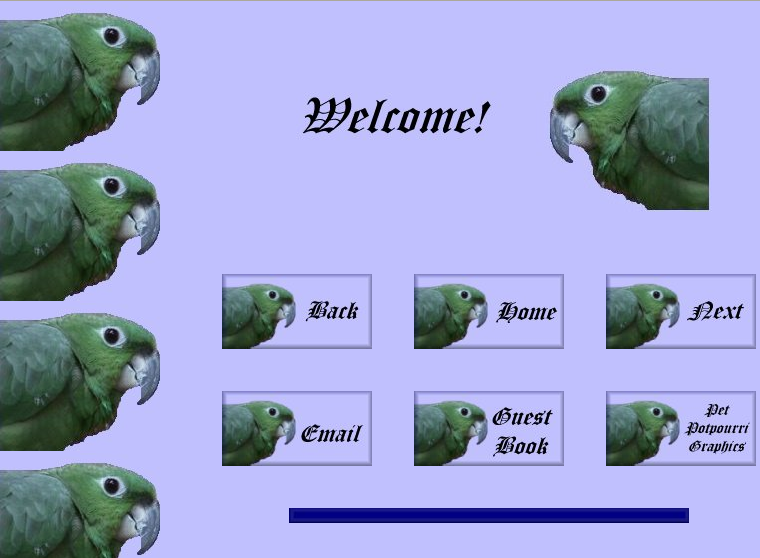
So when visitors had to decide something anyway, many webmasters used the opportunity to create welcome pages describing what’s laying ahead.


Original URL: http://www.geocities.com/Tokyo/Towers/7492/

In many cases their appearance differed from the following actual web site, deliberately standing out in the navigation flow and creating dramaturgy. The MIDI Universe for example embeds the question whether to use frames in a space setting. Take a step back and consider the big picture! The following pages give the impression of having zoomed into the cloud or ocean surface of the planet. Dive in!


Original URL: http://www.geocities.com/SunsetStrip/Palms/7120/

Speaking of MIDI: Of course any serious web site with music playing in the background would use frames: one constantly holding the music player while others could be used to navigate around.

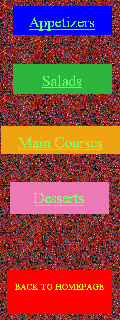
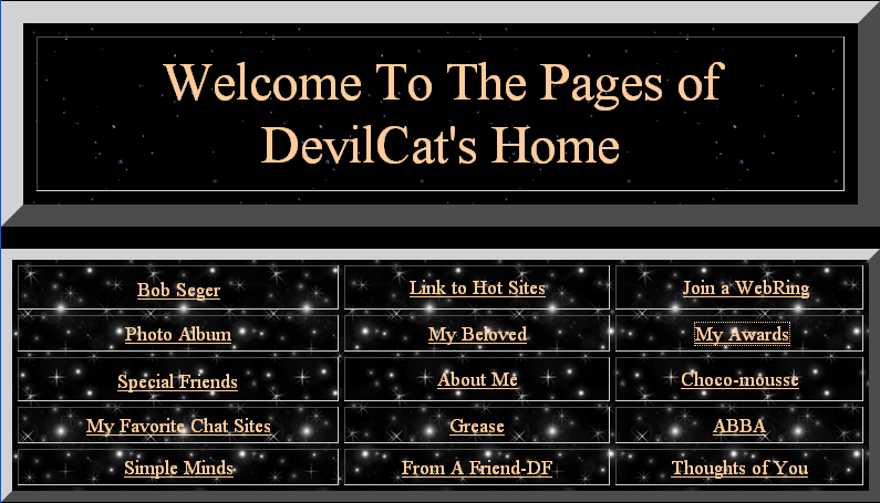
Typically, one of the frames was filled with links to all parts of the site, and the minimal setup consists of just two frames, navigation aid and content. This meant that webmasters had to provide two navigation systems, one for frames and one for no frames. The most efficient way was probably to include the no frames-navigation on the site’s first “content” page. The downside of this approach was that in frames mode, visitors would see the navigation two times, once in the navigation frame and once in the “content” frame.


Original URL: http://www.geocities.com/SiliconValley/Lab/5481/frames.html

Another very popular style was to create a different starting page with the navigation for no frames that would not show up in the frames context. Since webmasters offering frames usually also preferred the frames mode, the no frames version would in many cases fall out of their sight, soon be forgotten and missing updates.


Original URL: http://www.geocities.com/SouthBeach/Boardwalk/2643/

Commercial web sites liked to use frames for branding. Splitting the browser window allowed to place a visually stable logo on screen that wasn’t affected by the visitor scrolling in another frame. Of course amateurs did the same with their sites and branded them with their names or their made up companies’ names.


Original URL: http://www.geocities.com/SouthBeach/Sands/5486/

Some frame branded pages would display double branding, with two different logos. The reason is similar as with navigation frames: The frames version shows an additional logo, and no frames got its own logo. I suspect that many webmasters created two different logos on purpose, because it looks much less confusing than having the same logo twice.


Original URL: http://www.geocities.com/SouthBeach/Boardwalk/2643/frames.html

Finally, the choice of frames vs no frames reflected the joy of playing with new technology. Many sites were started before frames became available as a design tool. So when web masters added them later, they got filled with elements not necessarily related to the rest of the pages, very likely “multimedia” things. It is common that a frames site contains Java applets, MIDI music, javascripted scrolling and so on. No frames was there as a safe option, for people who had’t yet upgraded their browser or owned a weak computer that couldn’t handle displaying six HTML pages at once.


Original URL: http://www.geocities.com/TheTropics/Shores/9911/menu.html

Assorted examples


Original URL: http://www.geocities.com/RodeoDrive/1031/


Original URL: http://www.geocities.com/SouthBeach/9128/


Original URL: http://www.geocities.com/Hollywood/Set/4440/


Original URL: http://www.geocities.com/SouthBeach/4413/


  1. See the part about frames in Olia’s “A Vernacular Web” for more details on the impact of this tag. []
  2. Read some condolences by Tobias Leingruber. []
  3. And the later established style of frame layouts would become a strong sign for “online” in print design as well. Advertising posters for online companies for example would show compositions reminding of framests. []

Original URL: http://www.geocities.com/SoHo/Easel/8469/

Version 1.1 of the Netscape browser was released in March 1995. It introduced a new weapon to the arsenal of home page makers, namely, background image attribute. Since then making or choosing a picture that would make a web page look like not a web page became the joy for generations of webmasters. And a challenge. Images had to be (still have to be) as small in file size as possible to be able to come through the line before the user is ready to click the next link. And, unlike, the wallpaper on the computer desktop, you can’t choose a motive with a fixed size.

Because webpages don’t have a fixed size, they are going to appear on the screens with unpredictable resolutions and dimensions, in browser windows that can be opened full screen, half screen, or 3/4.1 That’s why the most typical way to a make websites look like outer space, brick wall, paper, etc was to use tiny repeating images cutted smartly enough so that the borders in between the repetitions would blend smoothly and not be noticeable.2

Geocities research, and especially surfing through Hertland and SoHo neighbourhoods, made me notice some particular techniques. For example nested tables, a way to make page ornamentally rich, but still adaptive to different browser window sizes. As well as sets, that consist of a background image and navigation elements that fit to it.

Another revelation for me were bordered backgrounds or “borders”. Of course the Geocities Archive was not the first time and place I’ve seen them. But before I didn’t see how wide spread they were.

Bordered backgrounds, usually with an ornament on the left side, proved to be a risky business. They were wide in oder to prevent the border to appear second time. But what looked reasonably wide in 1995, lets say 600 pixels, looked outdated already in 1997. On my screen today such background would repeat itself 3 times.

There was also another type of bordered backgrounds, where the border was horizontal. The ornament would appear on the top of the page. They were even more problematic than vertical ones. See an example.

Vertical borders showed disbelief in technological progress, assuming that screen would not become wider than let’s say 1024 pixels. Horizontal ones showed disbelief in the users (or your own ability) to have content for a page longer than that.

In 1999 Yahoo bought Geocities, and among other stuff introduced a tool to make web pages almost in an almost WYSIWYG way – Yahoo PageBuilder. It included a collection of graphical elements and of course a list of dozens backgrounds. With personalb.gif among them:

Personalb as well as its siblings personalr(ed), personaly(ellow) personalp(ink) and personalg(reen) has both vertical and horizontal borders. Apparently it was made for pages that wouldn’t exist for long and wouldn’t contain a lot. It is s a square of 1050×1050 pixels. There is a touching roundish notch in the corner, for the first letter of the user name.

Many Geocities profiles are build using page builder and its graphics. But personalb.gif pops up most often (subjective observation). Probably the reason is that it is a default image and appears in the PageBuilder tutorial, which is still available at the YahooSmallBusiness web hosting service.

But maybe the reason is more sophisticated? Can it be that web users were longing for the Facebook color palette already in the 1990’s?

Anyway they tried to cope with the template.

Sometimes it worked perfectly:

Original URL Original URL Original URL

(Screenshots above are cropped, to concentrate on the left part.) With “worked” I mean, that there was exactly so much content put into the template that a page wouldn’t be longer than 1050 pixels and the blue line wouldn’t re-appear in the bottom. But even the users most loyal to the template (those with very laconic profiles) couldn’t cheat time, so personalb.gif treacherously repeats in the right corner of their pages today. Like in the example below:

Original URL

There are many examples, where you see that users gladly used the profile even when they saw that their content wouldn’t fit into 1050 pixels.

Original URL Original URL Original URL

The last example is most extreme, because personalb.gif repeats 12 times. The page is really long. One can ask why would those users choose a background that is obviously too short for their purpose? Are they blind? But may be not. And by choosing a background image that is too small they intended to emphisize how huge are the things they want to say and show.

Despite several interesting examples I found after analyzing 44 pages build with the PersonalPageBlue template, and beside noticing a curious tendency to use different yahoo templates on different pages within one profile, I should conclude that PersonalPageBlue does not look disturbing in two cases.

1. When it is left empty

Original URL Original URL Original URL

2. If it would be gorgeous anyway.


Original URL


  1. Except for the shameful cases when web designers spawned postcard popup windows to simulate fixed sizes. []
  2. This still is the most typical way, though with today’s CSS page authors have more control about where a background image appears and how or if it should repeat. []

Splash Screens, these web pages that announce one is about to enter somewhere with the next click, described and recommended for commercial web sites in David Siegel’s legendary book Creating Killer Web Sites, are today thought to be one of the most annoying things the web of the 90’s had to offer. On Geocities they seem to be not very common, instead most page authors chose to place a “Welcome” message and offer navigation options right there.

Anyway, Prince Etrigan created a very nice splash screen: The metaphor of a state border is used to claim a place on the web, at the same time it “allows” you to move freely. While most splash screens seem to hold travelers up, this one gives a sense of relief. There is a state (a private kingdom in fact), but this state is not like the ones in reality. Knowingly or not, this welcome greeting oscillates between Barlow’s A Declaration of the Independence of Cyberspace, ideas to bring this freedom to the actual world, e.g. as demanded by the noborder network and virtual art states like NSKSTATE.1

We got used to “travel” freely around the internet. For 90’s web users, it was a completely new experience. And at the time a technical challenge. Today became a political challenge to keep it this way, while the web has also grown an oppressive face against real-world travelers.

Original URL: http://www.geocities.com/TimesSquare/1141/


  1. That one definitely looked better in the 90’s! []

In addition to my last post on claiming copyright as a sign of strong envolvement, here is another striking example: user “sunshiney”, an at the time 17 year old girl from Norway who got online 1993, thinks of this background as the finest creation of her life. And indeed it is marvelous. While other artists used the more or less invisible “comment” part of image files to state copyright lines, sunshiney named the file:

copyrightsunshiney.jpg

Personally, I recommend you to use this image, but keep the file name in tribute to the author.

Original URL: http://www.geocities.com/SiliconValley/Lab/5481/

Original URL: http://www.geocities.com/SouthBeach/Suite/6312/wavs/wavs.html

Original URL: http://www.geocities.com/Paris/Bistro/3133/recipes/page1.html

After a short technical break, I was happy to access the archive again and to be welcomed by DevilCat on his page full of stars and table borders.

Star backgrounds stand for infinity. Table borders are clearly elements generated from code: structural, a bit rough and clumsy – but in fact more authentic than Zeros and Ones. The combination of these two elements every time seems like the perfect look for Cyberspace.

Original URL: http://www.geocities.com/SunsetStrip/Mezzanine/4531/

This new torrent of Geocities unifies the original release plus the patches. Thanks again to the Archive Team for releasing both!

With this combined torrent, it is possible to seed the data forever, without having to keep two copies of everything. And I kindly ask everybody to do so!

Download @ Piratebay

UPDATE 2011-05-02: If you had problems with the torrent before, please go and check the link again. I fixed the torrent after some reports of it not being compatible with many clients.

The Archive Team released a patch to the Geocities Torrent, fixing the last 0.05% of the download that never seemed to arrive and some broken archives that couldn’t be decrunched before. Hurray!!

It is already the second day the computer is working hard applying this patch, using scripts published here before. To use this patch we had to stop seeding the torrent, because the patch is consistent which the data the torrent is spreading. Going online again would mean to erase the patch. So, after applying the patch is completed, we will publish a new torrent containing the patches (if the Archive Team itself will not do it themselves in the meantime).