Category Archives: Uncategorized

I don’t know how to begin writing about web pages made “In loving memory of -“. They’re too personal and emotionally loaded for a formal analysis. No, writing is already the next issue, I don’t even collect and categorize them, nor do I bookmark or tag them. I don’t take screenshots and can’t even “save the image as”. Which is a trouble because these images and layouts are very strong. Often unique, probably because I’m not the only user who stopped herself from appropriating parts of these tributes.

Pages of web masters in grief are loaded with the belief that through “the network of the networks” you can establish a connection with those who are no longer among us: through links, buttons, forms, applets … These pages are medium specific in the ultimate way — being a system (infrastructure) for communicating with lost ones.

A quote from Scott’s talk at the Personal Digital Archiving conference earlier this year:

“This is a site created by a mother to commemorate her lost son, who died
as an infant. What struck me, if you look at the dates, is that he died
in 1983, a full 15 years before Geocities came along, and her feelings
were still strong in two ways – she wanted to keep his memory alive, and
she saw Geocities as the way to do it.”

“Graphic, Animation, and background by Ivelisse Hernández © 1997 & 1998”

Original URL: http://www.geocities.com/SoHo/Cafe/2625/

The Wizard is still there, but you can’t build anything with it. I’m still guessing why Yahoo! keeps a lot of Geocities supplementary stuff online.

What you get by downloading the Geocities Torrent is not actually an “archive”. It contains many 7zip archive files, but how the data therein is organized is not fit to make statistical analysis. The Geocities Torrent tells the story of a great disaster and salvation, also in its structure.

For example, to simply answer the question “How many Geocities accounts are contained in the torrent?” or “What was the most used divider image in a certain neighborhood?”, counting index.html files is not enough. For this, we need to know the original directory structure on the Geocities server, and since Yahoo! didn’t give anybody access to it directly, we have to rely on the information about it that was available to the Archive Team via HTTP during the time when they made the copy. Also, the Archive Team had to pack the data for optimal distribution, which worked very well, and created an almost entertaining downloading experience.1 But the big amount of symbolic links makes it difficult to do even simple counting.

Users do not like case-sensitive file systems

Geocities used the powerful Apache web server on an unknown Unix-like operating system.2 User account names, neighborhood names plus directory and file names were stored case-sensitive on there, meaning that the file “Hello.html” is different from “hello.html” or “heLLo.html”. Traditionally, most users do not understand why there should be a difference for the same name written in a different case. “Consumer” operating systems (aka Windows and Macintosh) do not distinguish case in the file system. Most users of Geocities didn’t care for case when putting links in their HTML code, for example they could link to http://www.geocities.com/bob/dogs/ when the actual file name on the Geocities server would call for a link like http://www.geocities.com/Bob/Dogs/.

Apparently, Geocities followed two strategies for easing their users’ pain with case-sensitivity:

Symbolic Links by Geocities

They created symbolic links in their file system that pointed from Bob to bob.3 This means that when looking into the directorly bob, it will always contain the same content as the directory Bob, and vice-versa. Symbolic links are a powerful file system feature, however it is very easy to create train wrecks with for example directories that contain a link to themselves: an infinite loop in the file system. What’s worse, when looking at a site through a browser, symbolic links can not be distinguished from a real file or directory. So both Bob and bob would exist as if there were two users instead of one. And the Archive Team of course hadto save both variations, because, without looking inside of each directory, they wouldn’t know if there maybe was another user that went with the same name in lowercase.4

There are many ruins of symbolic links to be found in the torrent, especially of the type that creates infinite loops.

mod_speling

There is a plugin for the Apache web server, mod_speling, which tries to correct wrongly typed URLs and redirects the browser to the actual URL with the correct case. It appears like at some point the Geocities server was equipped with this module — otherwise it would be a miracle how all this could function in general. However, the mirror tool wget used by the Archive Team to copy Geocities, will still save the file under the original request name. So if you ask wget to copy bob, it will be redirected to Bob and save what is found there, but still locally give it the name bob.5 And again it would result in a potentially duplicate file.

This is neither the fault of Archive Team6, the wget developers or Geocities. HTTP and HTML were designed in a certain way, but when millions of users are let loose on a technically well-defined standard, unpredictable things happen.

Where the Archive Team detected duplicate downloads, they replaced them with symbolic links in their copy’s file system. While this makes browsing the data much easier, it also leads to problems about deciding for what operation which type of symbolic link has to be followed. If for example a symlink makes a whole sub-neighborhood exist twice in two different spellings, this symlink should be ignored. A symlink to an user’s account that is stored in YAHOOIDS should be followed though. It would be possible to develop a logic that takes all of this into account, but it will be prone to errors, resulting in some research operations having to be repeated when bugs in research scripts are found. And each run can take ages! So it seems like a good investment to fix the file system before going any further.

Fixing

  1. Most analysis on the Geocities Torrent will have to be conducted through HTTP and an Apache webserver running mod_speling. Redirects will have to be taken into account.
  2. All symbolic links have to be resolved. Steps:
    1. Use the command find . -type l to catch the first level of symbolic links.
    2. Use readlink to determine where symlinks are pointing and replace them with the original files (first rm the symlink, then mv the original to the symlink’s location).
    3. Repeat steps C and B until no symbolic links are left.

    Of course, every round of found symlinks has to be examined manually for infinite loops or obvious traps.

  3. Find directories and with “almost equal” names, e.g. names that would be found by mod_speling. Compare the pairs’ contents. If the contents are equal, decide which is the original and delete the other. If the contents are partly different, merge the contents and keep only one version. If the content is different, keep both versions. (Probably should be done using diff.)

Each of these operations takes from hours to days. So please bear with us for a while :)

  1. How the user accounts were pouring in which the arrival of each 7zip file was simply blissful. []
  2. We know because Apache generates certain kinds of index and error pages that can be found in the torrent. Also, the file system is definitely case-sensivite. []
  3. It is not clear if users were also allowed to create symbolic links. []
  4. If they had taken the time to compare all this, there would probably be no torrent at all. []
  5. Browsers still do the same: How often did you save a PDF file with the name download.php? []
  6. In fact, using the default behaviors of standard software was the best choice in this case, because now the coming about of the data can easily be reconstructed. If the Archive Team had made assumptions on how the Geocities server was configured and had modified wget accordingly, a lot of data might have been lost. []


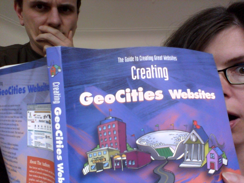
Olia and Dragan reading chapter “Adding Multimedia to your GeoCities Site” (p 213)


We ordered the book, after finding this review:


Original URL: http://www.geocities.com/PicketFence/1284/oldindex.htm

The EXTERNAL LINK led to Amazon where it is still possible to buy “Creating GeoCities Websites”, and much much cheaper than 12 years ago. $0.10 against $39.99 in 1999. But I wouldn’t recommend to do it. Even in 1999 readers left very skeptical feedback.

May 14, 1999:

“This is absoluately a laugher, an entire book on how to design a website for ONE specific free webpage server, and unfortunately, a heavily contraversial one with their excess amount of involuntary advertising of themselves using pop-up ads […]”

May 20, 1999:

“This book is a terrible resource on designing web pages. I suppose if you wanted your site to look like every other pitiful GeoCities site out there, then you could find a use for this book.”

And last but really last, I don’t think there will be any more. September 28, 2005:

“the book was printed in 1999, so all of the information i needed about geocities was way outdated. product sucked”

The following is an addition to the Personal Page Blue findings.

Shown are the Blues of the last two decades, as seen on pages and profiles of web users.

1995

1997

1999

2006

2010

As you might already have noticed we are always happy to find a website that was created in 1996 and is still exists in its original design. But nothing can compare with the pleasure to find a page that was made in 2011, but looks like made in 1998.


Original URL: http://www.geocities.com/Heartland/Pointe/4104/main.html

HTML frames, introduced to web users in 1996 with version 2.0 of the then-dominant browser Netscape Navigator, offered a way to divide the browser window into rectangles, each showing a different HTML page. A lot has been written about this most controversial tag in the history of markup languages. Already in the year it was created, usability experts announced that it breaks fundamental rules of hypertext and navigation. Users, until this moment happily following all new technical enhancements given to them with each software update, developed strong opinions if frames should be used or not.1 Finally, in today’s web, frames are not used anymore – they even have been removed from the HTML5 standard.2

All this battle aside, fact is: Frames made possible new kinds of structures and graphical effects not possible before in the browser.3 And Geocities carries thousands of examples on how amateurs used them. Remarkably, the frames debate is very present in their pages’ designs, because visitors are in most cases given the choice: frames or no frames.


Original URL: http://www.geocities.com/SoHo/Gallery/2826/

Asking web site visitors such “technical” questions is professionally considered a capital usability offence. In some corners of today’s web you can still find the quite similar “Flash or HTML?” But frames or not wasn’t only a technical question, it was a new approach on how to deal with controversies online: just give people a choice and everybody will be happy.

So when visitors had to decide something anyway, many webmasters used the opportunity to create welcome pages describing what’s laying ahead.


Original URL: http://www.geocities.com/Tokyo/Towers/7492/

In many cases their appearance differed from the following actual web site, deliberately standing out in the navigation flow and creating dramaturgy. The MIDI Universe for example embeds the question whether to use frames in a space setting. Take a step back and consider the big picture! The following pages give the impression of having zoomed into the cloud or ocean surface of the planet. Dive in!


Original URL: http://www.geocities.com/SunsetStrip/Palms/7120/

Speaking of MIDI: Of course any serious web site with music playing in the background would use frames: one constantly holding the music player while others could be used to navigate around.

Typically, one of the frames was filled with links to all parts of the site, and the minimal setup consists of just two frames, navigation aid and content. This meant that webmasters had to provide two navigation systems, one for frames and one for no frames. The most efficient way was probably to include the no frames-navigation on the site’s first “content” page. The downside of this approach was that in frames mode, visitors would see the navigation two times, once in the navigation frame and once in the “content” frame.


Original URL: http://www.geocities.com/SiliconValley/Lab/5481/frames.html

Another very popular style was to create a different starting page with the navigation for no frames that would not show up in the frames context. Since webmasters offering frames usually also preferred the frames mode, the no frames version would in many cases fall out of their sight, soon be forgotten and missing updates.


Original URL: http://www.geocities.com/SouthBeach/Boardwalk/2643/

Commercial web sites liked to use frames for branding. Splitting the browser window allowed to place a visually stable logo on screen that wasn’t affected by the visitor scrolling in another frame. Of course amateurs did the same with their sites and branded them with their names or their made up companies’ names.


Original URL: http://www.geocities.com/SouthBeach/Sands/5486/

Some frame branded pages would display double branding, with two different logos. The reason is similar as with navigation frames: The frames version shows an additional logo, and no frames got its own logo. I suspect that many webmasters created two different logos on purpose, because it looks much less confusing than having the same logo twice.


Original URL: http://www.geocities.com/SouthBeach/Boardwalk/2643/frames.html

Finally, the choice of frames vs no frames reflected the joy of playing with new technology. Many sites were started before frames became available as a design tool. So when web masters added them later, they got filled with elements not necessarily related to the rest of the pages, very likely “multimedia” things. It is common that a frames site contains Java applets, MIDI music, javascripted scrolling and so on. No frames was there as a safe option, for people who had’t yet upgraded their browser or owned a weak computer that couldn’t handle displaying six HTML pages at once.


Original URL: http://www.geocities.com/TheTropics/Shores/9911/menu.html

Assorted examples


Original URL: http://www.geocities.com/RodeoDrive/1031/


Original URL: http://www.geocities.com/SouthBeach/9128/


Original URL: http://www.geocities.com/Hollywood/Set/4440/


Original URL: http://www.geocities.com/SouthBeach/4413/


  1. See the part about frames in Olia’s “A Vernacular Web” for more details on the impact of this tag. []
  2. Read some condolences by Tobias Leingruber. []
  3. And the later established style of frame layouts would become a strong sign for “online” in print design as well. Advertising posters for online companies for example would show compositions reminding of framests. []

Original URL: http://www.geocities.com/SoHo/Easel/8469/