Author Archives: olia

CA: Yeah, so you’re surfing with a purpose, kind of. You have a hunch now that maybe people in the Pentagon neighborhood are using Felix, and you’re kind of also cataloging other information, but you’re mainly looking. Maybe it’s like these things are being presented to you, the information is being presented to you and you are just trying to identify what’s important.

(Cory Arcangel interviewed us for strictly-formal.org)

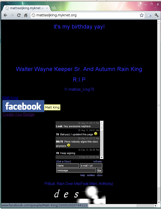
Every day, since March, after Philipp Budka’s presentation, I browse through profiles on MyKnet, Canada’s Aboriginal social network and can say that amount of people moving to Facebook is growing. At the same time, people with Facebook profiles continue to update their MyKnet profiles. Some times there are only reminders that the person has moved, some times proper illustrated reports about their life.

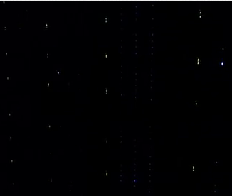
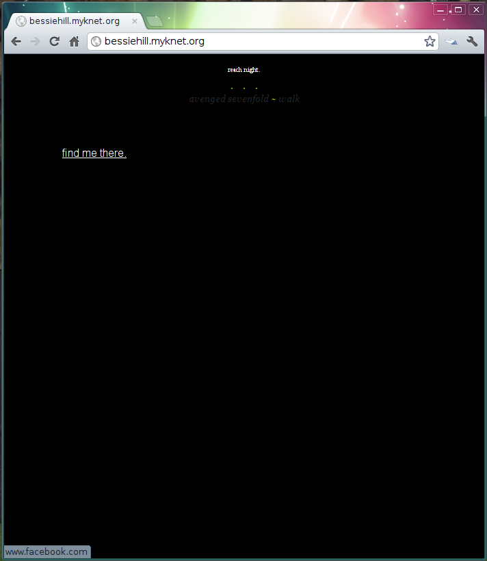
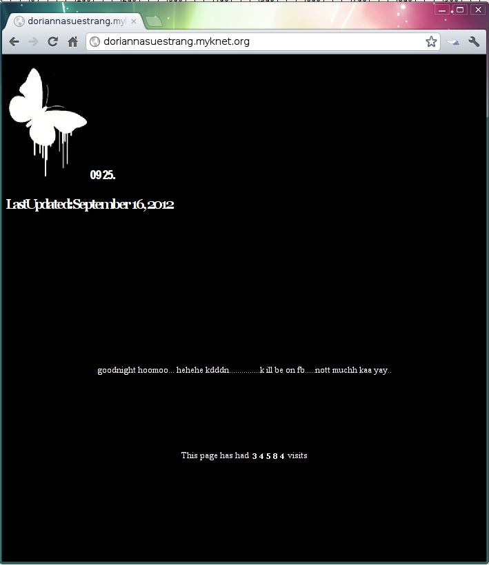
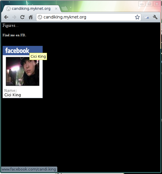
Some black screens:


I like the idea of A Book Apart to make “brief books for people who make websites”, and I order their books for my interface design students to provide them with text written by designers who are a) not making websites in Photoshop b) have their opinion about web design as a profession c) can write.

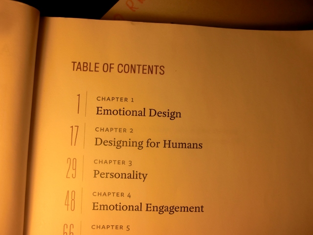
But the book #5 Designing for Emotion gives me hard time. Look at the titles of the first 4 chapters … and now imagine that they (and the rest of the book) are written without any mention or reflection of web sites people were making in the 90’s and are still making. Sites that are emotional and personal and human for real, not because of a marketing strategy.

The author, Aarron Walter, confesses in the beginning that for him the WWW started with dot.com with the gold zeros and gold ones rush. Maybe that’s why he doesn’t know or doesn’t want to know that the web outside of company websites and facebook profiles is and always was a very human environment. And beside it, makers of early web pages command an impressive set of instruments to appeal to the emotions of other users, to keep their audience and to be special and authentic.

The ignorance of web design professionals to the vernacular web started in 1997 and still progressing. Instead of valuing the rich history of their own medium, they’re proud when their web sites look like comics, magazine spreads, bottle labels or cartoons. Web designers, learn from the users, learn from the 19 (not 15!) years of web design, dig through the Geocities Torrent with us. It will bring you closer to “emotional design’s primary goal to facilitate human-to-human communication” (p.29), if this is really the goal.

P.S. Designers at Work

Found this picture on my desktop. I can’t remember what profile it comes from. May be it is not even from Geocities. And I’m not sure if it was planned for this blog or for car metaphors

Why in the second part of the 90’s animated GIFs were rarely (outside of porno sites) used to show film and video sequences? Because even half a second of heavily compressed and and downscaled, barely recognizable footage would be still too heavy and slow network of that time.

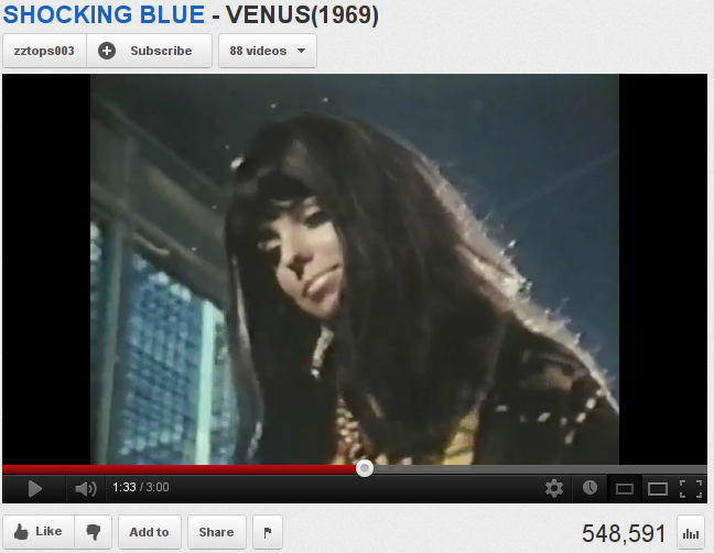
In 1998, Shocking Blue fan Greg converted one second of a TV performance of the group’s hit song “Venus” into a GIF. It is 160×120 pixles, contains 15 frames and weights 93KB. Greg didn’t dare to confront the visitors of the page with such a huge file.1 He uses a static image and suggests to start loading the animation with a click, but to be ready that “it may take 20 sec”.

Starting image

Animated GIF

The moment in the original video

Original URL: http://www.geocities.com/ofmang/greg/shockblu.html


  1. Just for comparison, the third picture in the Alternative Animated GIF Timeline, a video loop as common in GIFs today, is 461×322 pixels, 2MB, 42 frames.
    []


Original URL: http://www.geocities.com/vienna/4302/

null

Original URL: http://www.geocities.com/~johanh/

The page is still on(VRM)line.

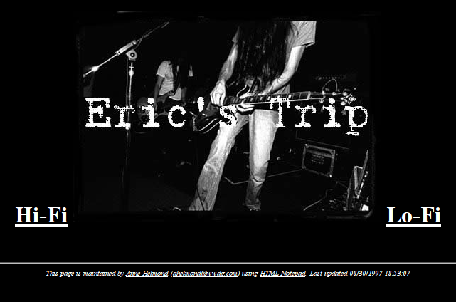
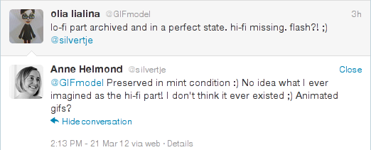
New Media researcher Anne Helmond asked if her 1997 “Unofficial Eric’s Trip Homepage” at SunsetStrip/3500/ was archived.

It is there. The lo-fi (html) part is almost complete and functional, only guest book and “Sounds” are missing. Hi-Fi link leads to a non existing ethi.html.

As I mentioned in Ruins and Templates of Geocities, we rarely know whether missing files were lost due to glitches during the archiving process, or to the site owner’s lack of skill or failure to maintain the files and links between them. But this time I could ask the user personally what was there.

Anne said that probably she never ever made a HiFi version and can’t remember what she planned for this.

It is so 1997! I remember myself believing that broadband is just some weeks away and preparing for the nearest future with links like that. This can be it. Broken links were links to the files to be made very very soon.

Original URL: http://www.geocities.com/SunsetStrip/3500/


I was happy to present our imaginary social networks and services of 1997 — Once Upon — at Unlike Us, hosted by the Institute of the Network Cultures in Amsterdam.

It was a great event with a truly interested and competent audience. The only problem was that in the end it was mostly about Facebook, even though in The Netherlands Hyves has still more users than Facebook.

That’s why it was very important to see the presentation by Philipp Budka from the Department of Social and Cultural Anthropology at the University of Vienna. He talked about Myknet, an obscure Canadian social network and web hosting service.

[…] a system of personal homepages intended for remote First Nations users in Northern Ontario. This free of charge, free of advertisements, locally-supported online social environment grew from a constituency base of remote First Nations in a region where numerous communities lived without adequate residential telecom service well into the millennium (Ramirez, Aitkin, Jamieson, & Richardson, 2003; Fiser, Clement, & Walmark, 2006). MyKnet.org now hosts over 30,000 registered user accounts, of which approximately 25,000 represent active homepages. This is particularly notable considering that the system primarily serves members of Northern Ontario’s First Nations whose combined population is approximately 45,000 (occupying a geographic area comparable to the size of France). Equally significant is that over half of this population is under the age of 25, making MyKnet.org primarily a youth-driven online social environment.

A simple alphabetic list of all the users makes it possible to go from account to account. You can also look at the last updated ones and see that there were already almost 400 pages updated today. It is only around 14:00 in Ontario now.

The first impression: Myknet users make their pages in a special way that is obviously influenced by some simple and not strict content management system or a custom made site builder. Would be interesting to get access to it.

Clearly, the pages are made for low resolution displays and slow connections.

The most exciting fact is that they look exactly like classic homepages, but many are used like tweets or status updates. Visually and structurally it is an unexpected mix. See examples on the top of the article.
Many users have moved to Facebook, leaving their facebook badge on Myknet — functioning like classic “this page has moved” notices.

Many accounts are deleted or were only updated in the last decade, which is interpreted like it never happened by the database.

Working Title:
From Heartland Neighborhood to Pinterest.com.
The Rise and Fall of “organizing and sharing the things you love” Culture.

Fig.1.1
Homepage of heartlandhelpinghands, Heartland’s satellite.

Fig.1.2
Pinterest.com with menu “Everything” unfolded.