Category Archives: Uncategorized

“I am a free woman now, I married Blingee”

786318694_1027372823700784_1983193

A month ago, on the 14th of August 2015, the online image manipulation service Blingee.com announced their sunset. Unlike similar situations — the closing of Geocities (2009) and Hyves (2013) when it was rather archivists, journalists and researchers who showed their concern, not the actual users — with Blingee we witness a very emotional response of the community, of people who were still on. Users were asking and begging not to close, offering money and suggesting financial models, users were thanking the service for the years of joy!

Five days later, the Blingee Team came to their senses: “We have heard you loud and clear. […] We are happy to announce that Blingee.com is here to stay.” I’m far from thinking that the owners changed their mind out of philanthropy, but still it is a great precedent. And I also think it is so important to listen to the users. “Talk to the user!” – I encouraged myself and approached one of the most popular Blingee makers, glitter master and vintage queen — Irina Vladimirovna Kuleshova, also known as kuleshova or ivk. The interview was conducted in Russian, via email, in between 5th and 10th of September 2015.

753149027_1511992 Irina, thank you for agreeing to answer my questions. I have many: personal, philosophical and purely technical. I will begin with the most simple one: I started to pay attention to your work in the very beginning of 2014, noticing that Blingee.com is filled with collages using your gold stamp. Can you say that it is your most popular one? … continue reading

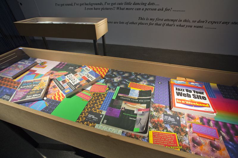
“In Cyberspace Pixels are Free” is the wisdom from the first real web design textbook — Kreating Killer Websites by David Siegel (1996). It became the name of the installation Merz Akademie student Max Semmler made out of my library for the Digital Folklore at HMKV.
… continue reading

I’m an early Blingee adopter, I remember the times when you only could use a fixed set of stamps (see the FAQ page) and there were only 10 pages of them. I used blingee as a tool, as a subject, as an environment to spread myself as a GIFmodel, for teaching to make students follow and break the logic of software. I made and received blingee cards. I admire Blingee as a tool and–from the outside–as a community, and it is my first answer when I’m asked “Can you give examples of contemporary Digital Folklore?” Blingee.com was dear for me in many aspects and of course I feared that one day it will be gone and that it will happen rather soon.

***

Now it is 17th of August 2015. Two days after I got to know that Blingee.com is closing and 8 days before it will actually vanish. Unbelievable, but true: a service nine years old allows their users only ten days to grab their creations. It’s maybe enough time to save what you want, though some made thousands of animations, and the Blingee Team din’t provide any export function. Users are suggested to download pic by pic. It is slow! and it also what is not really needed, probably users saved their pics after creating them anyway.

No export function means that there is no way to transport interactions and connections. You can’t save your profile and see your circles, awards, friends and the way your stamps were used in the pics of others. All this could be done if services like webrecorder.io would be available for everybody (Update from October 7, 2021: In the meantime, Conifer, the successor to webrecorder.io, is available for everybody at https://conifer.rhizome.org). Blingee is exactly the case where recording interactions and paths would be able to show each stamp in its full power: where and how it was used by others. But webrecorder is in beta and Blingee Team didn’t want to wait.

Another remark I’d like to leave here is that Blingee.com is represented quite well on Archive.org. With quite I mean — enough to get an impression about the kind of graphics that were produced there and even how their aesthetics changed through the years. The the tool that was used to make the graphics is of course impossible to capture by a classic web archive. Probably it can be best remembered from users’ How to make blingee videos on youtube. I suggest this one from 2010 in 11 parts (part 5 is missing) and the one I recorded yesterday.

***

It should be said that “sunsetting” in August and giving 10 days is equal to closing without saying a word. August is not November (as it was when Hyves was closing), people are on holidays, AFK. It is especially true for Blingee’s audience. I don’t have numbers, but a big part of blingee makers are Russian grandmothers, who spend their summer with their grandchildren at dachas. School begins in September, in the end of August they’ll come back to their computers and see their favorite service gone.

Those who are online these days are sad, devastated, making suggestions and financial offers to the Blingee Team, begging not to delete, comforting each other, exchanging facebook and email addresses. It happens on profile pages and in the forum. It is webrecorded, till page 22. If you read it you see that there is hardly an angry message, no sarcasm, no irony. Indeed, how to be angry about a service that costs nothing, was improving, was there in the most difficult moments of your life! How to be angry about the dog which looks in your eyes like this?

And users make farewell blingees. They are getting more and more and more and more monumental and heartbreaking with every hour. Blingee has a long history of “in memory” pix. It’s users know how to mourn.

***

According to the article on Fusion, Blingee developers “chose to focus on our mobile app” that promises “Amazing Special Effects for Mobile Video”. Blingee users move on to picmix as it seems.

Time to say goodbye. But let me first mention five important things about Blingee.com and why it was important for web culture:

1. Blingee started as a tool and developed into a community

It is difficult to say when it did happen (Blingee Team for years never answered my emails), but it happened. Blingee was not only working on their tool and new features, but providing space for communication and interaction. Or let me put it like this: they didn’t restrict communication and also didn’t channel it into an extra chat or an app. People could communicate in comments or in create groups and topics in forums. Doesn’t sound like a revolution, I know. And not something to impress venture capitalists. And not anything they will have with their mobile app. But it’s a precious, vanishing approach: users found a way to communicate and are left alone. Blingee users created a very welcoming and supportive atmosphere without a real name policy and without the suggestion to “say something nice”.

This brings me to the next point:

2. Blingee is a “stupid” tool

There is a term many of us use–stupid network: a neutral network that just delivers packets, without looking inside. It is a positive term and the idea is indeed very important, if not vital for the Internet. In Blingee’s case, intentional stupidity or neutrality was manifested by not restricting their users in what the stamp could be. It didn’t have to be glitter, you didn’t have to make it animated! It started as a tool to pimp up your photos, but in the end of the day you could just use it as an image processing software, as a tool to make collages and work with layers. Again, as with user comments and forums, Blingee was just providing.

3. By making your picture you were making pictures of others

This one is very important for me. And this–not the technical format (GIF) or visual appearance (glitter)–is what really makes me think about Blingee as a perfect example for Digital Folklore. If you upload a stamp, you can decide to make it available for everybody. This is ideology. Very Web 1.0 ideology. Or let’s say, the philosophy of web-page-making 20 years ago. Blingees are little web pages. They are modular. You can see what are they made of and use stamps you like in your own blingee. Looking at a blingee in blingee display mode is like going through a 1990’s free graphics collection that amateurs used to exchange elements for their homepages.

That’s why on one hand, I’m facepalming when I read that Blingee was a “web 1.0 service”: It is of course a classic Web 2.0 service, technically and chronologically. And aesthetically! Glitter is Web 2.0!! But on another hand–yes. If there is a service that kept spirit of Web 1.0 production, it is Blingee.com

4. You didn’t have to log in

It may contradict my excitement expressed in 1., but it is just another aspect. And again a strategy that is precious, but getting more and more exotic today. To make a blingee you don’t have to log in. You didn’t have to be a member, don’t have to be a part of the community. You could just use the tool and vanish with your download.

5. It was recognizable

It is the last and may be really least important for me, but would be unfair not to mention: Blingee was recognizable as a style, also in the sphere of glitter generators. Stamps that we know from the first pages of “most popular” and “most dynamic” made their way into web folklore, became self referential and iconic.

***

I have a list of bad lessons to learn from Blingee. And I promise to never publish it if Blingee Team changes their mind and leaves everything as it is.
After Kurt Eichler, Inke Arns and Dragan Espenschied wished a lot of fun to the first visitors of the Digital Folklore Exhibition, I allowed myself some melancholy:

You will see a lot of bright, animated, loud and funny stuff here. It looks like fun, but it is a sad exhibition. Not because web pages of today are made differently, but because we don’t make them at all. Not so much because the web looks dull, but because it doesn’t have a look at all. It is invisible.

The web disappears together with the browser. Did you notice that it has less and less buttons every month? That its borders are getting thinner every week? Did you notice that since some days you don’t see the names of files in the location bar on your smartphone? Less and less of everything…

It disappears because we don’t design it, don’t build it, we only post into prepared forms.

As a keeper of the One Terabyte of Kilobyte Age archive, I’m proud to present what we’ve collected and restored. We show to you many web pages, many pages in the history of the world wide web. But we can’t restore the web.

I’m happy that students worked so enthusiastically with the archive, that their projects look so great, but I know they will not make pages for themselves. They don’t need to.

The web is everywhere, it survived everything, outlasted all competitors, became an unbeatable technology, but is not seen as a medium anymore. A big loss, because the WWW is the best what happened to the Internet and all of us.

The One Terabyte of Kilobyte Age archive is the home of many broken web pages. Missing plugins, missing images, missing fonts — lead to scenes that are best described as ruins. The most dramatic appearances I tag as RUINS in hope to come back to them and for restoration. It is a challenging task, mentioned in the earlier post every missing image has its own story.

Since May 2015, Monique Baier, student in the project “20 years of web design” at Merz Akademie was working through the collection. She managed to find missing materials and restored 20 pages. They are stored and publicly available at our new subdomain http://restoration.geocities.institute/.

To make the process more vivid, Monique recorded the magic moment when a broken page is reloaded to shine in in the light of its completeness. Pages are opened in an original browser of that time, and filmed from a CRT monitor set to 800×600 resolution.

16 Ruins Restored videos are one of the central works of the Digital Folklore exhibition.

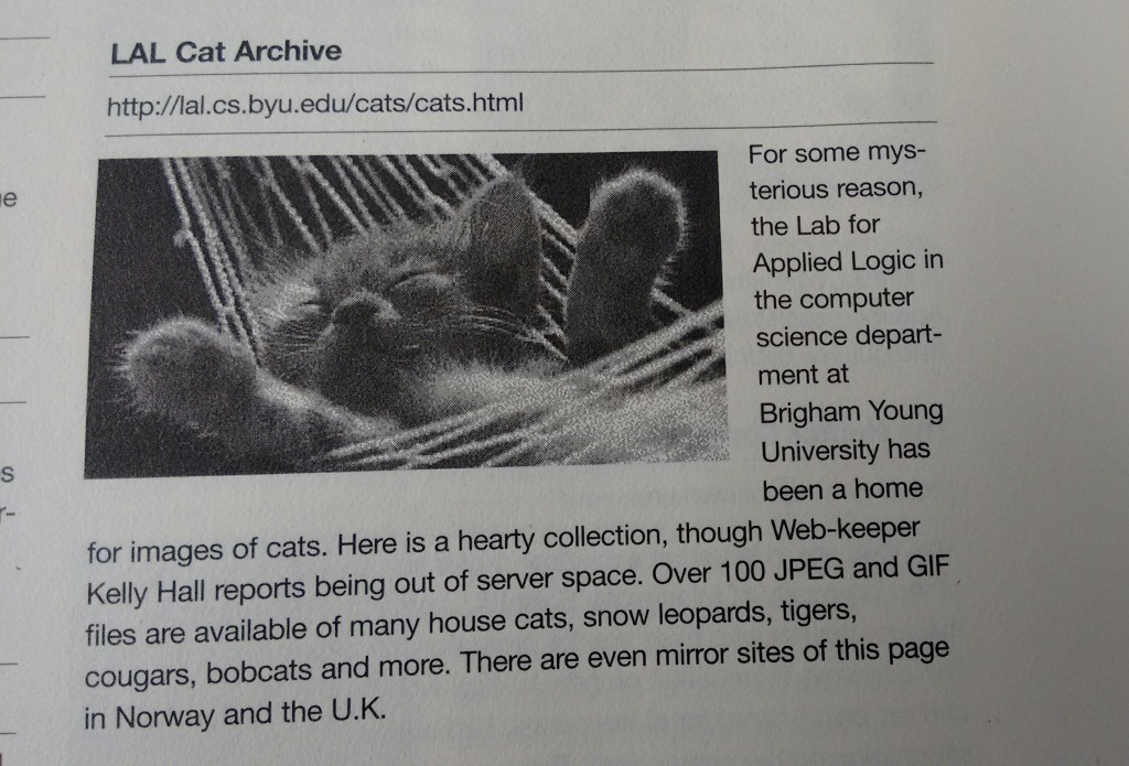
From: Atlas to the World Wide Web, published 20 years ago. It is is one of these brave books that attempted to introduce the Internet and its services to potential users and web masters and provide a list of WWW resources. It is one of these gorgeous books that had the full text of the book “fully hyperlinked” included on a CD-ROM. One of these heavy books that became obsolete even before they would exit the printing press.

… continue reading

“Dreaming the Chinese Web (1996-1997)” is a magic series of nine 800×600 GIF animations composed with graphic elements sampled from the first year of GB2312 GeoCities. The compositions preserve the original formats of the graphics and framerates of the animations, enshrining them in an unclickable, undecomposable artwork looping until the end of time – or until your close your browser window.

“These aren’t webpages, yet they might as well have been – if you stare at them long enough, you can dream of what the Chinese web was like,” says Gabriele de Seta, the author of the series.

“Before UNICODE, the simplified characters of Mandarin Chinese were encoded in GB2312, one of the most popular versions of the guobiao (‘national standard’) character sets of the People’s Republic of China. The earliest websites encoded in GB2312 to be found in the One Terabyte of Kilobyte Age archive date back to September 1996 – presumably the year in which the earliest Chinese users of GeoCities uploaded their first homepages for the world to see. Out of 381,934 archived GeoCities pages, only 14,209 are encoded in GB2312. While today one on six global Internet users is Chinese, twenty years ago only four percent of the amateur web was encoded in Mandarin.

Delving into the first year of Chinese GeoCities means traveling back in time to the early days of the Internet in China. The pioneering webmasters who discovered and ventured into GeoCities – Andy Zhang, Liu Dong, Benny Li, Lu Wenhu, Philip Zhai among others – were mostly university students, technicians, or academics. The webpages they designed, linked, experimented with, forgot and abandoned are a product of their times: tech tutorials, personal homepages, fan tributes, coin divination, videogame walkthroughs, tea expertise, politics and philosophy. The materials they built their websites with are a transparent testimony to the vernacular creativity of early amateur users: starry night backgrounds and T-Rex animated GIFs share 800×600 frames with Chinese pavilions and sword-wielding immortals. Pixel-art dragons and Japanese anime characters stand side-by-side with smileys and rotating stars. One webpage is just a wooden wall background with a red “Happy Chinese New Year” poster hanging there in the center.”

“Dreaming the Chinese Web (1996-1997)” will premiere at the Digital Folklore exhibition at HMKV (Dortmund) on the 24th of July 2015

You may also want to read this great Interview with Gabriele on Rhisome.

We are happy to announce that from the 25th of July till the 27th of September 1st of November 2015, the world’s first Digital Folklore exhibition will be on display at HMKV in Dortmund.

Opening: Friday 24 July 2015 | 7.00 pm

The exhibition is based on the One Terabyte of Kilobyte Age archive, which comprises the remains of 381,934 GeoCities homepages made by amateurs in the pre-industrial era of the World Wide Web. GeoCities, the first free web hosting service, was created in 1994. Only five years later, it was sold to Yahoo!, the contemporaneous Internet giant, which eventually shut it down in 2009. Although GeoCities holds an eminent place in the  history of the WWW as one of its period’s most visited servers, it has already fallen into oblivion. All that is left are the legends and rituals surrounding it.

I’m Josh and I am building this page to have some fun. My life is boring. If it wasn’t for the internet I would die of boredom.
SouthBeach/Channel/1284/ 1999-07-14

Among the 28 million files—hastily copied before total deletion—are user-built personal websites, fan, mourning, recipe, arts and crafts, computer game and pet pages, rotating “Welcome To My Homepage” and “Under Construction” signs, blinking star wallpapers and jittery animated characters. For the purpose of this exhibition, these and many other manifestations have been elaborately digitally restored and reinterpreted by the net artist and folklorist Olia Lialina (@GIFmodel), the artist and digital conservator Dragan Espenschied (@despens), and their current and former students from Merz Akademie; Saskia Aldinger, Monique Baier, Helena Dams, Darja Daut, Robin
Diedrich, Frederika Eckhoff, Lisa Hofmann, Christopher Lauber, Susanna Müller, Hannah Saupe, Sonja Schmid, Sophie Schulz, Maximillian Semmler, Madeleine Sterr, Mona Ulrich, Marc Wiethe.

Supported by the US artist Joel Holmberg (@dotkalm), the expert for Chinese net culture Gabriele de Seta (@SanNuvola), and Jason Scott (@textfiles), head of the Archive Team and responsible for the original data rescue.

In the next weeks we are going to tell you more about our findings, restorations and objects in the exposition.

Curators: Prof. Olia Lialina (Stuttgart; GRI, Merz Akademie), Dragan Espenschied (New York; GRI, Rhizome) Kommissarin: Dr. Inke Arns (Dortmund; HMKV)
In Cooperation with: Merz Akademie — Hochschule für Gestaltung, Kunst und Medien, Stuttgart

P.S. Digital Folklore reader is almost sold out!

Why to make home pages today
Transcript of my talk given at superglue.it launch on the 3rd of October 2014 at WORM, Rotterdam

It is a great feeling to speak at the event which launches a device packed in a box that instructs:

“Make your own webpages and host them at home.”

Sounds simple and humble. But there is so much in this sentence – a 20 year history of love-hate relations between users and developers, users and providers, users and the internet, users and the www.

It also contributes to a long web debate about what a home page should be.
Let me explain and argue why you should actually still make one.

“Make your own home page” is an old appeal. It is older than the mid 90’s. Not even 1994, but 1992. On the internet, one year is equal to ten astronomical years, there is a century between 1992 and 1994. … continue reading

Roses are Red,
Violece is Blue,
Yahoo sucked ALWAYS,
Now GEO does TOO!!!

Half a year ago speculating on what to expect from 1999 on Geocities, I didn’t mention may be the most important fact. It was the year when Yahoo bought GeoCities.
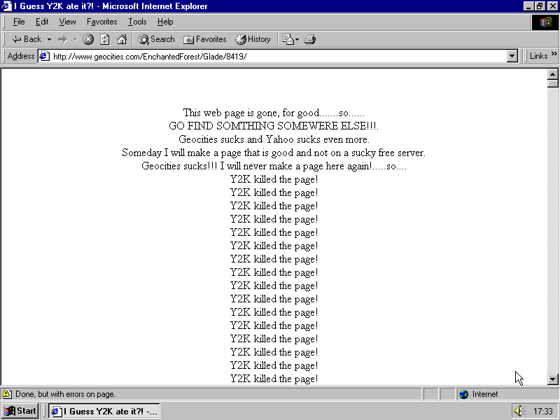
Till the end of June users reaction to this deal was rather calm. Annoyance was growing, people complained about pop ups, banners, water marks, but anger was still directed to GeoCities. The first (to appear in our archive) clearly anti Yahoo page comes on the 27th of June. It lists Yahoo sins as theGooCities owner and a search engine

You can’t see the last paragraph, so let me paste it here:

It was bad enough when Geocities got all commercially and intiated the geoplus and “pages that pay” crap, but now i’ll never go back to another geocities page. I hope all the companies that use Vortals continue to do so, so yahoo folds. THEY SUCK! I WILL REJOYCE THE DAY THEY ARE CRUSHED BY COMPETITORS AND FORCE INTO BANKRUPTCY. I’d rather Microsucks bought Geocities than Yahoo. DIE YAHOO!! DIE YAHOO!! 1

This page can be seen as a presage of the real upraise that happened later that week. For the first time homesteaders started to blame Yahoo when giving a reason for moving to another service or closing the profile.

… continue reading